Get branding tips and expert advice delivered straight to your inbox.

Rebrands are risky business. But there are plenty of real-world examples of companies that took the leap and reaped the rewards. If you’re debating whether or not you should rebrand, use the following case studies as inspiration for what you can achieve. For small businesses and large enterprises alike, rebrands can present new opportunities to engage your consumers and reaffirm your brand’s values. Whether your goal is to maintain a healthy, dynamic brand, reinvent your business after a crisis or it’s simply time for an upgrade, you’ve come to the right place.
We’ve rounded up eleven of the buzziest rebrands to keep you inspired with fresh ideas for your own marketing makeover. How do you think they fared?
1. Facebook
Meta recently rose from the ashes of Facebook to usher in a new era and a fresh start. In a surprising move from Zuckerberg and co., the brand unveiled its new name and initiatives after months of ramping tension among stakeholders, activists and even the government. With the rebrand came a new logo, thousands of new employees and a new plane of existence: the Metaverse.
The Metaverse is an immersive virtual world accessible through the internet and the proper headset/goggles combo. Users can create their own 3D avatar and do everything from bowling to hosting an all-hands-on-deck meeting for their teams.
Although it’s too early to say exactly how much of a hit the Meta rebrand will be considered in the history books, there are three solid reasons why the New York Times says Meta’s recent rebrand could be a huge success. First, it shows Zuckerberg’s commitment to moving the brand identity into a new chapter. Second, the reorganization of the company around its new brand goals is beneficial for investors. And last but not least, Meta can have more authority over its offerings now that it’s building a product that the brand alone has control over.
2. Taco Bell
After years of “Yo Quiero” and chihuahuas, coupled with the rise of fast-casual options like Chipotle, this well-worn taco chain knew it was time to elevate its visual identity. The rebrand earned it an 8% overall growth in revenue, so we can confidently say Taco Bell’s audience wanted it too.
The soft launch of the brand’s new image? A new Taco Bell “Cantina” restaurant in Vegas, of course. Customers visiting the Cantina could shop branded Taco Bell merchandise, enjoy an alcoholic beverage, browse digital menu boards, choose from a tapas-style menu and relax in a VIP lounge that no restaurant in Vegas is complete without.
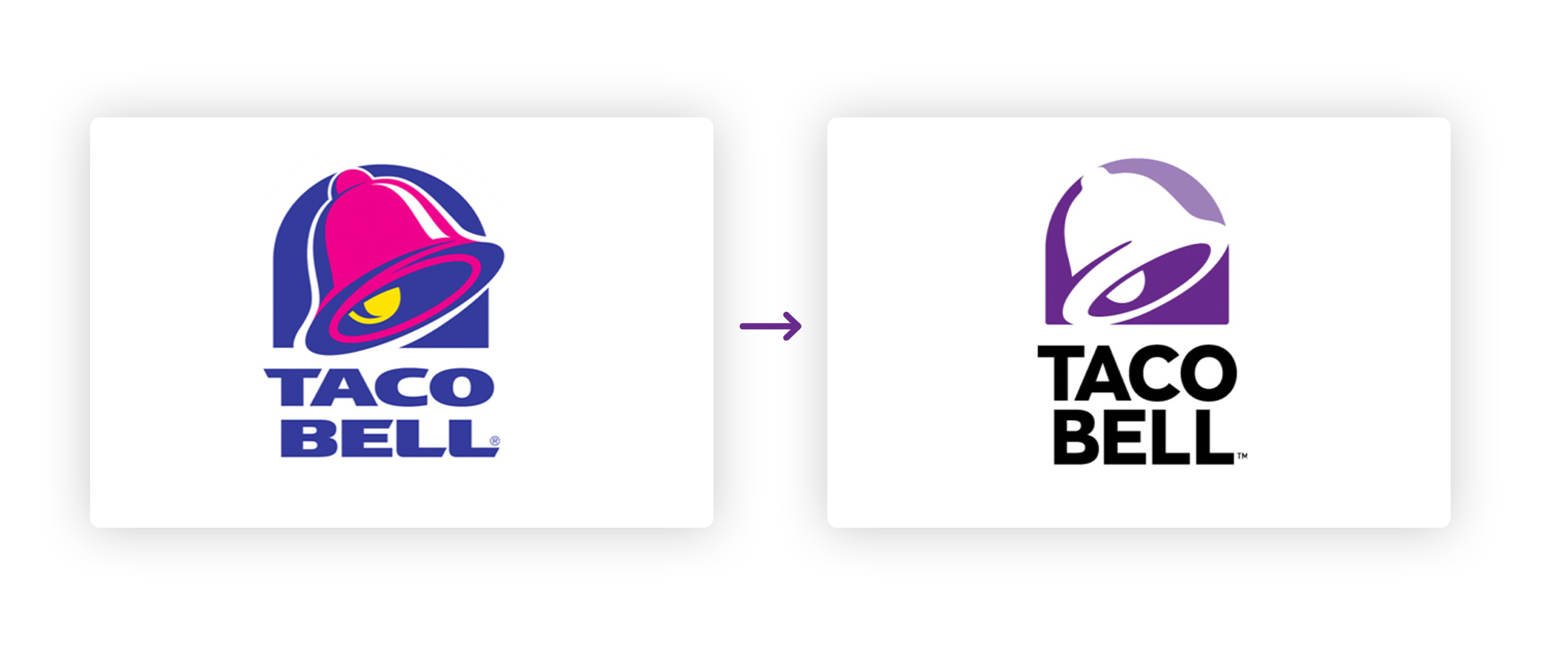
The new logo, created collaboratively by Taco Bell’s internal design team, TBD, and creative consultancy Lippincott, created a logo that fits with the brand’s new restaurant strategy: one size doesn’t fit all. Its 1995 iteration was given a modern look, allowing for customization through patterns, textures and different use cases.
The restaurant rebranding was met with praise at launch, and Taco Bell has enjoyed some good press after being named one of the healthiest fast-food chains in America. Hey, if Taco Bell has managed to position itself as a healthy option in the fast food world, we think that earns them a spot on this list of important rebrands.
3. McDonald’s
Whoever said looks don’t matter clearly hasn’t seen McDonald’s 2021 packaging rebrand. The design, dubbed “aesthetic minimalism”, combines item names, simple shapes and bold colors to make the Instagram-worthy new wrappers and boxes.
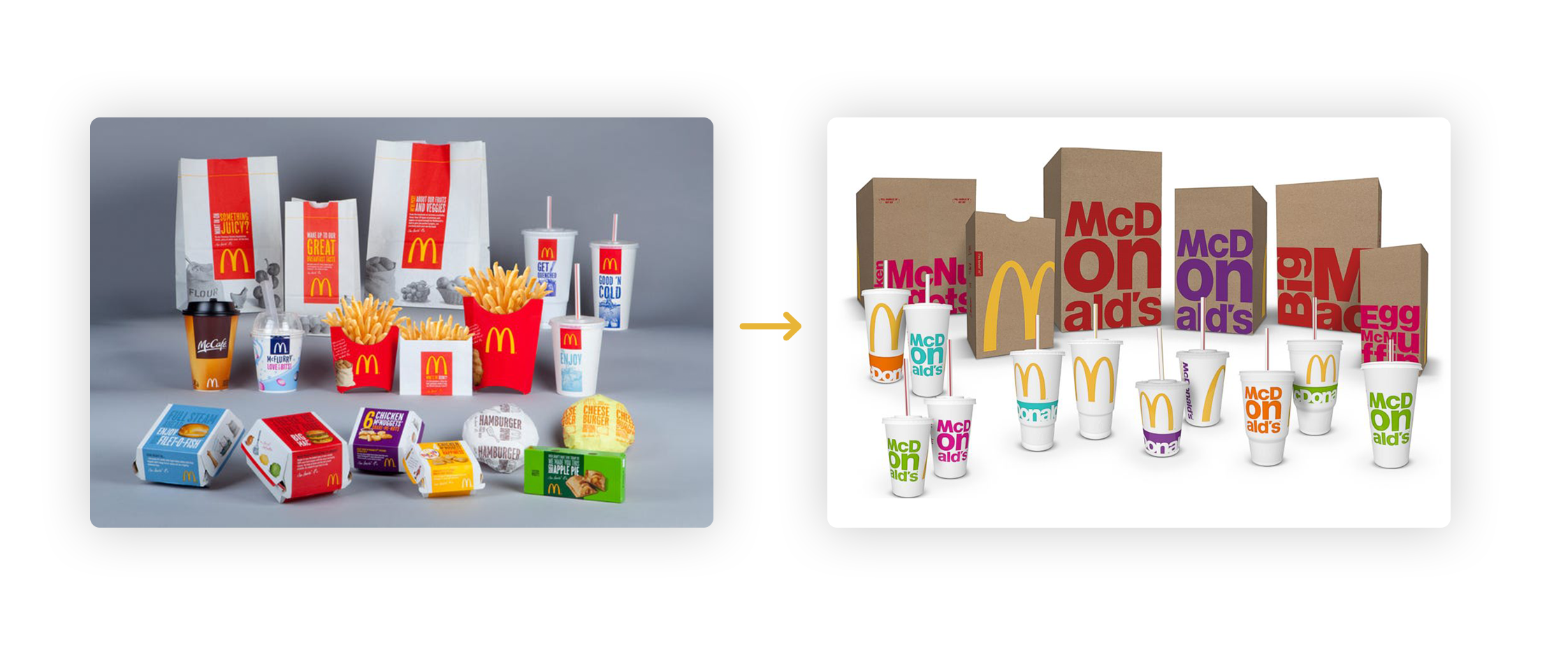
Not only has this rebrand transcended language barriers for a global audience but it has also successfully infused McDonald’s unique sense of playfulness into every item. From ocean waves on Fish Filets to illustrated cheese slices melting down the sides of Big Macs, this simple rebrand proved to be fun for everyone.
Meanwhile, McDonald’s logo, products and other marketing campaigns have remained the same. It just goes to show that even the simplest of changes can make a big impression when it comes to rebrands.
4. Adobe Creative Cloud

Adobe has done such a good job coming up with new and advanced products that it ended up making its extensive library of tools hard for audiences to navigate and understand—oops! Luckily a rebrand came to the rescue.
In order to infuse functionality into every inch of its catalog, Adobe updated logos for products found within the Creative Cloud to a more modern color scheme, weight and font. It also swapped illustrated icons for icons with two-letter abbreviations of each product name. Smaller, more detailed updates include removing border outlines, rounding out app corners and making sure that products with similar functions are easy to choose between by adding bold, contrasting colors.
As for the Creative Cloud logo itself, the brand has chosen to change the icon from its signature red to a rainbow gradient. This update represents all the different products Creative Cloud offers under this one umbrella.
According to a press release from Adobe, “We’re making these branding changes to ensure our portfolio continues to be easy for our customers to navigate and understand and maintain a fresh look and feel.”
And guess what? It worked! Talk about finding a customer pain point and solving it. Sometimes a rebrand means so much more than just a new font.

5. Volvo
Volvo is giving its logo the Silicon Valley treatment with a new 2D, flat and minimalist design. The old logo created the illusion of shining metal and used multiple colors. Now the black and white rebranded logo shines in a new way by bringing its visual identity into modern times with its first makeover in seven years.
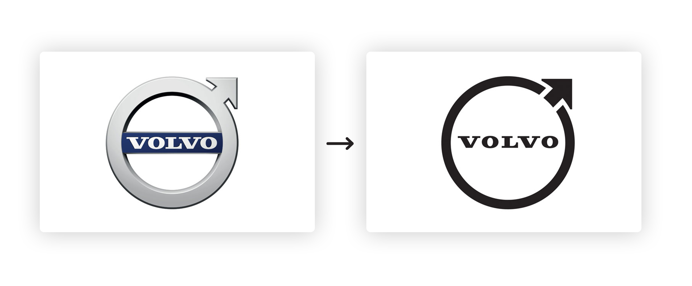
Although the rebrand was done quietly overnight without the usual fireworks you’d expect from a launch, critics called the update electrifying. Not only does the classic iron mark represent the interesting and vast history of the brand itself but the streamlined look also symbolizes a forward-thinking company.
In fact, the logo change was made in conjunction with the launch of the brand’s new electric SUV as Volvo continues to pave the way for accessible hybrid vehicles. A rebrand that pays homage to the past while looking forward to the future? Yes, please.
6. Instagram
When Instagram quietly unveiled its new logo in May of 2016, some loved it, some loathed it, and most of us thought a new app had appeared on our phones. The fact that everyone was talking about it and had an opinion? That’s what the world’s most important rebrands do.
So why did they do it? Six years after the photo-sharing app’s launch, it boasted more than 400 million users posting photos each month and 80 million photos every day. As Wired pointed out, “Those numbers boggle the imagination, and underscore how essential content is to Instagram’s continued growth.”
But Instagram was no longer just a photo-sharing service. With a suite of sub-brands, from Layout to Boomerang, and a growing focus on video, Instagram had fundamentally changed for its user, and its app design needed to reflect that change.
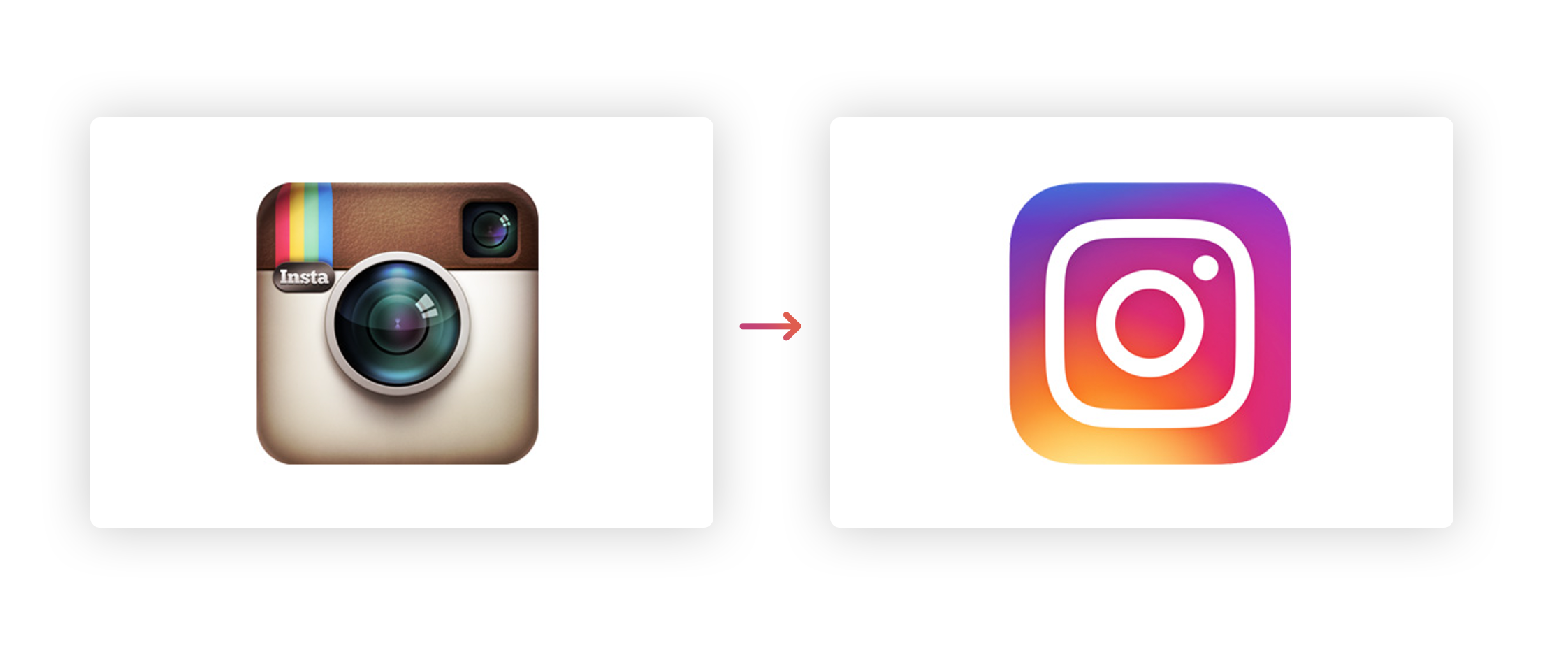
The new logo was flat, clean, and let the focus lay on advertisers and user content. The app itself better integrated Instagram’s own sub-brands in a more intuitive, user-friendly way. And while they still haven’t quite lived down that algorithm change, most users and brand experts agree that one of the year’s most controversial rebrands was also one of the most vital and successful.
7. Pfizer
Pfizer’s not just a pill company anymore and they’ve got the rebrand to prove it. After creating a ground-breaking vaccine to protect against COVID-19 the company knew it was time for a change.
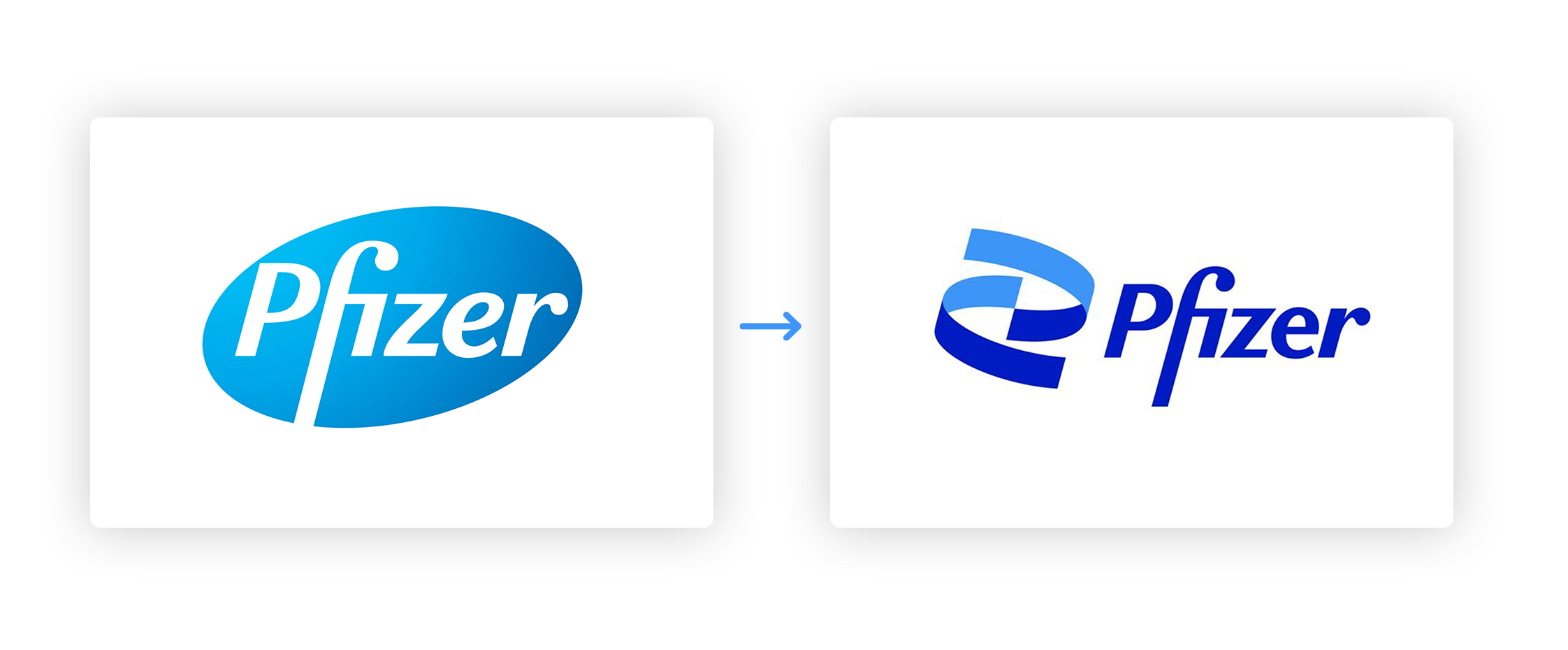
Many customers perceived their old logo to be too commercial-looking and not very science-like. How did Pfizer handle the feedback? By changing their main logo symbol from a pill to a helix, of course.
The brilliant design upgrade is one of the most well-timed and thoughtful rebrands we’ve seen. As CEO Albert Bourla has said, “Pfizer is no longer in the business of just treating diseases—we’re curing and preventing them.” What a powerful shift!
8. Mastercard
Another well-worn brand that hadn’t had a rebrand in two decades? MasterCard. Design agency Pentagram gave the credit card staple new website graphics, information pamphlets, a new logo and more.
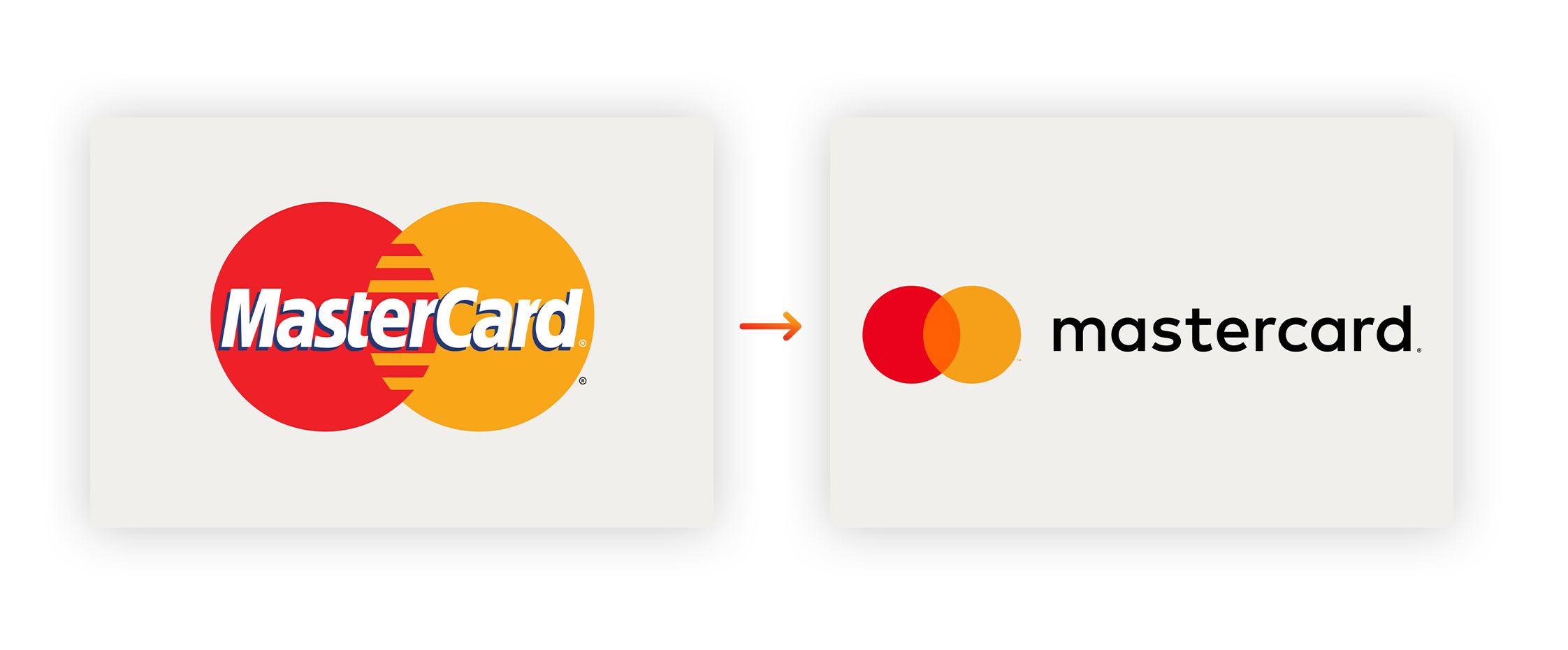
The recognizable red and yellow circles were retained and the logo, largely unchanged since the company’s founding in 1966, received a subtle refresh to usher the brand into the digital age where the rest of the banking world was already living. The rebrand was another vote for trendy flat designs, with Pentagram partner Michael Bierut explaining, “We took their DNA and went through this process of distillation. With each wave of simplification, it felt sharper, cleaner, and more flexible.”

9. Guinness
How do you rebrand a brand that’s over 200 years old? London-based firm Design Bridge found out in 2016 using two clear methods: a logo update and a wildly popular social media campaign.
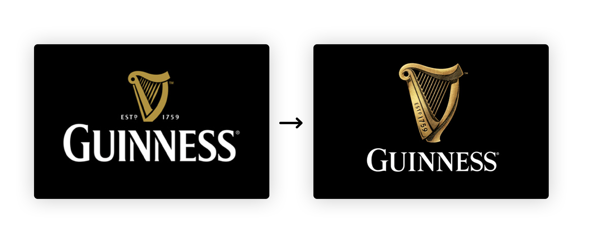
Bucking the flat design trend, they gave the Guinness logo more detail and dimension. They also started applying the techniques they learned from making iconic television commercials to their social-first ads, bringing the entire brand into the modern age in a holistic way.
Guinness kicked off its strategy on Facebook and Instagram with a three-minute movie about LA’s legendary Compton Cowboys. They did this as part of their award-winning Made of More messaging which aims to “celebrate people with character, integrity, and confident self-expression, and groups that live life on their own terms.”
After their rebrand, Guinness saw a revenue ROI of £19.90 per £1 spent with the total profit from the campaign nearly doubling the category norm. Not only did the rebrand bring the company into modern times, but it also caught the attention of a new target demographic on social media, which paid off in spades.
10. Pandora
Music streaming service Pandora has been around since 2000, and up until 2016, so had its logo. Pandora had faced increasing pressure from brands like Spotify until it finally made the switch. In the fall of 2016, it put forth a refreshed brand identity and a new subscription service its leaders hoped would contribute to one of the most important rebrands of the year. Luckily for them, they were right.
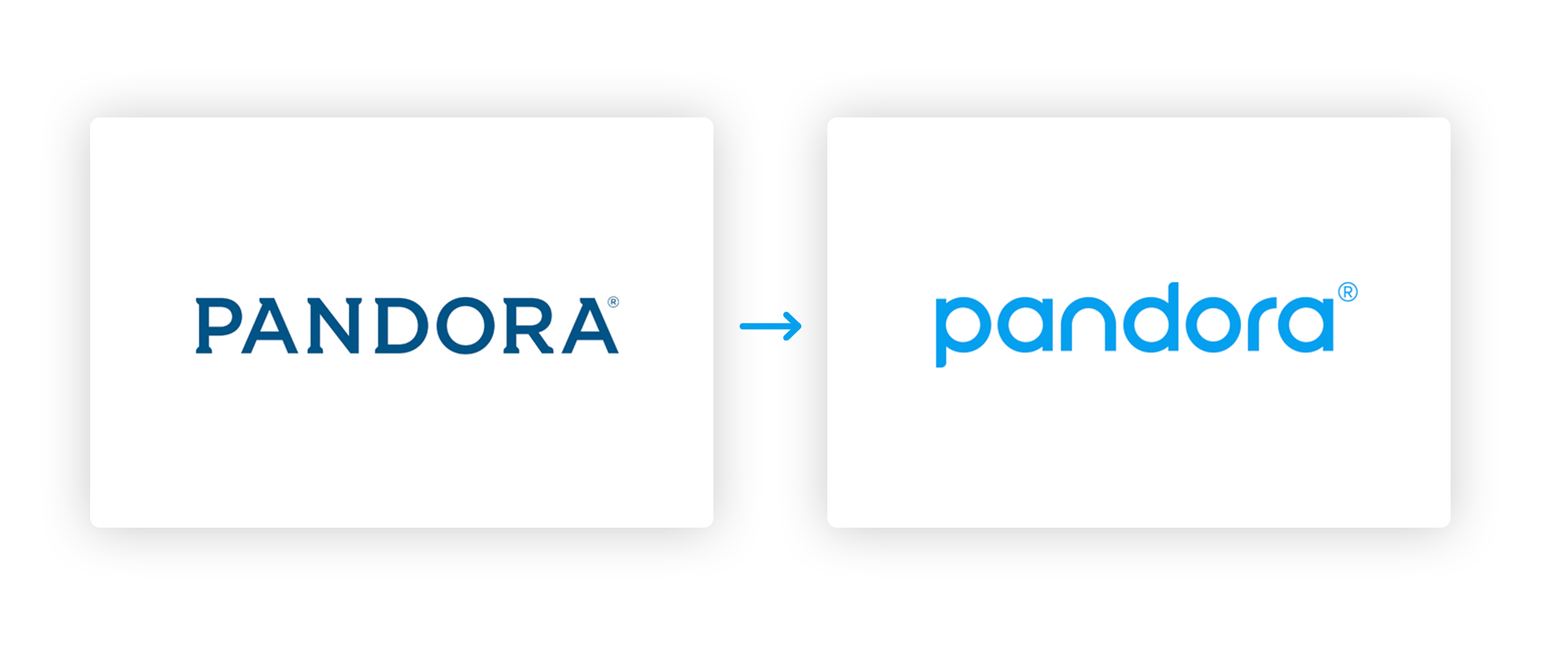
The new logo featured, you guessed it, a flat design and a new wordmark. Though the new design was not exciting, the campaign they released in conjunction with it definitely was. The block-style letter P has since been used at the center of many wildly colored and diverse designs ranging from black and white polka dot boxes to electric squiggles that “feel as though they could have been pulled from the 80’s-90’s MTV specials.” All of this showcased the brand’s new focus: personalization, personalization and personalization.
And even though their top competitor, Spotify, is having its moment, major outlets like Digital Trends even admit that Pandora offers music discovery features that outshine its contemporaries. All of this makes it possible for users to have a more unique and personalized music experience on Pandora’s platform than anywhere else. And that is exactly why Pandora’s strategic, USP-focused update makes it one of the most important rebrands.

11. Mozilla
Mozilla shared each step of its 2017 rebrand with their global audience. Although the brand has seen some challenging years, its open-sourced rebrand certainly garnered some good press and supported an impressive forecasted revenue of $500 million for 2021 (up from $465 million in 2019).
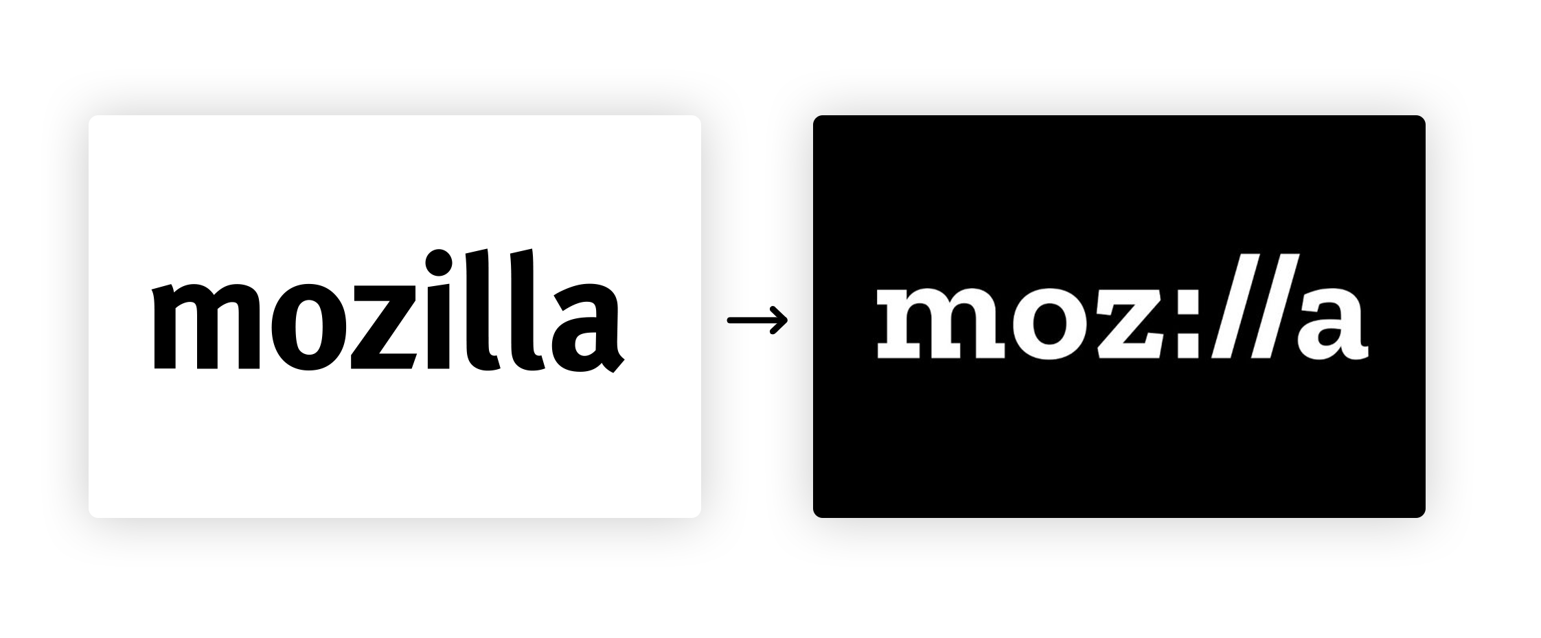
Mozilla shared several logo designs from London firm Johnson Banks online early in the rebranding process. It let anyone comment on the selection of logos, and spent the next five months reviewing roughly 3,000 opinions, before unveiling the final design.
Of the new logo, Mozilla’s creative director Tim Murray said, “Because it has a portion of URL embedded in the middle of the logo, you know this must be some kind of internet company.” Their new “letters only” logo also allows members to attach photos, graphics and .gifs to it, feeding into the “maker spirit” Murray hopes the new identity will harness.
So how was this experimental new rebrand received? Overall, pretty well! Most appreciated an original approach to the age-old process of rebranding. And, come on, we all like it when someone asks our opinion, right?
Why Are These Important Rebrands?
While you may not be facing a global rollout and the subsequent critique of a brand identity refresh, it is important to unveil your rebrand correctly. Bring the right people into the process early in the rebrand, unveil it to your internal team with all the flash you usually reserve for the public and make sure your new brand assets are easily accessible. That way everyone can start putting them to use immediately!
To find out how Brandfolder can help keep your brand assets organized during a rebrand and beyond, click here for a demo.