6 Minimalist Package Designs That Speak For Themselves
Minimalist packaging is a perfect way for brands to present their products in an original and dynamic way. But because minimal design is so hard to master and the materials that designers use are so simple in nature, creativity must play a huge role in the process.
Successful minimalist package design follows the simple and straightforward principles of minimalism, yet they are branded with succinct, self-explanatory messaging that describes exactly what a product is or how it functions. This type of messaging is blunt, concise and oftentimes quite entertaining.
If you’re thinking about designing minimalist packaging for your brand, or just appreciate this type of aesthetic, here are six products that have a lot to say for themselves.
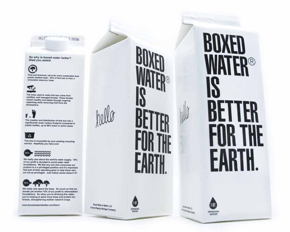
This brand has a strong belief–so strong, in fact, that their brand name also serves as their mission statement. Unlike plastic water bottles, these packages can be easily flattened for shipping, meaning that it takes 25 fewer trucks to deliver the same number of containers.
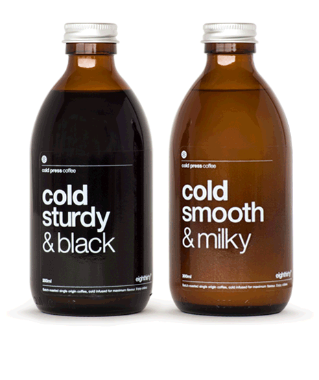
For hipsters and business executives alike, cold brew coffee is a must-have drink for summer. To stand out from other brands in the specialty iced coffee space, Eighthirty Coffee Roasters branded their cold brew bottles with succinct, enticing descriptions that don’t waste any time explaining what’s inside.
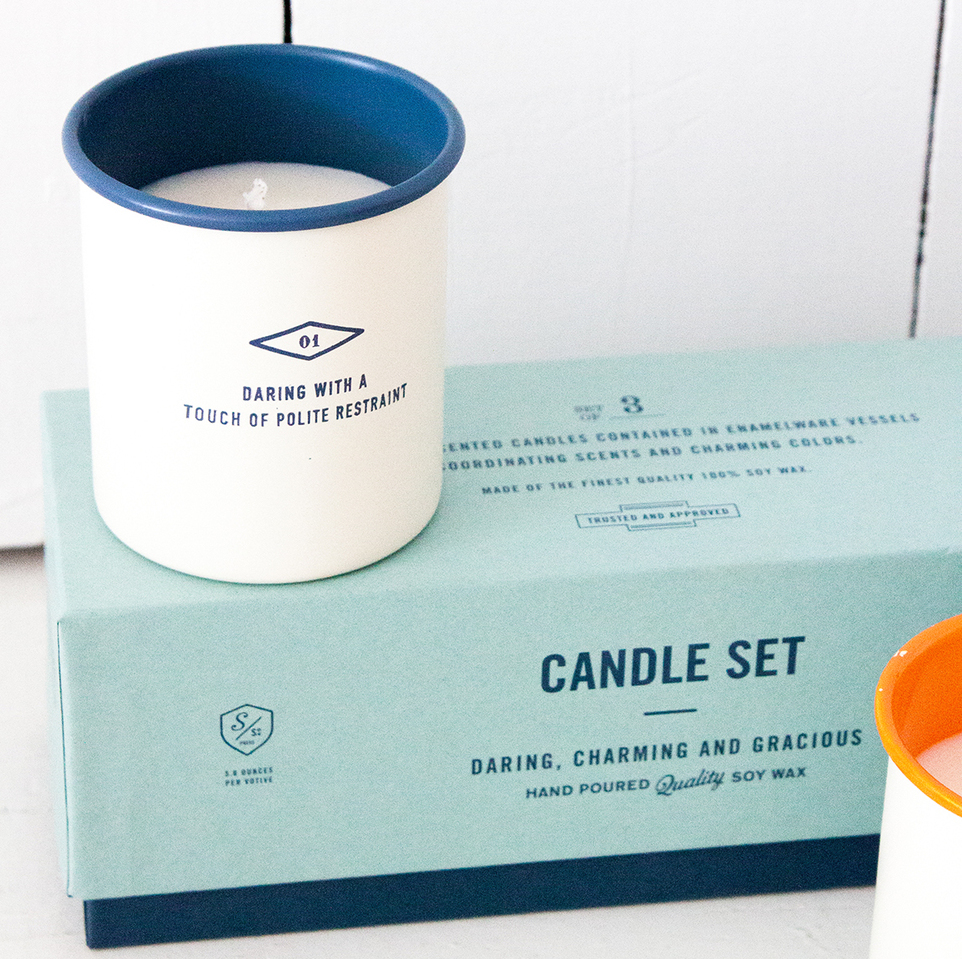
While the typography on these candles is small, it delivers a clear and concise product description. The line “daring with a touch of polite restraint” strikes a perfect balance between being descriptive, yet alluring enough to make you want to try it out.
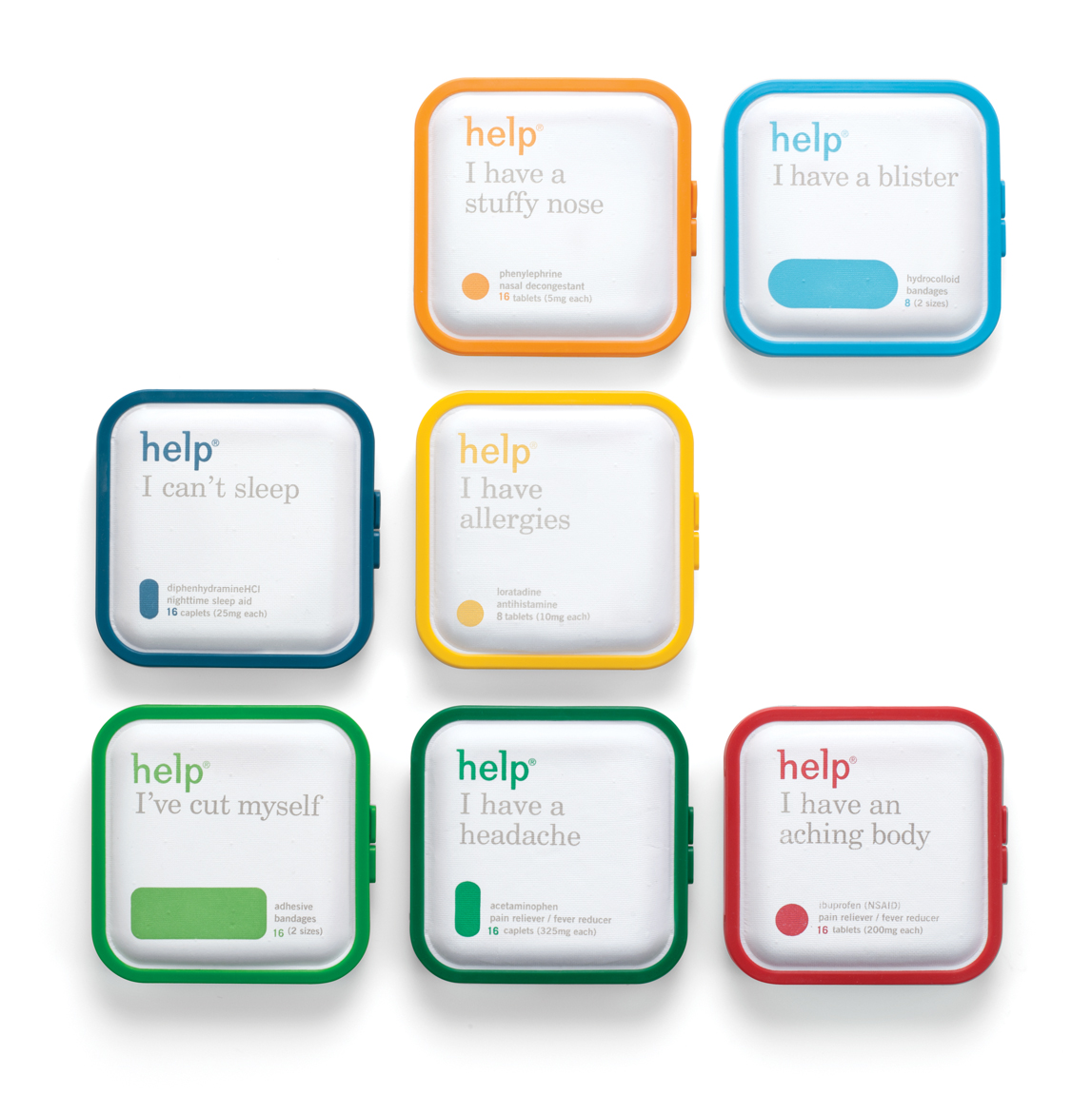
These petite medicine kits are the antithesis of everything the pharmaceutical industry stands for. Instead of creating a multi-purpose drug that is stronger and more effective than the last, Help focuses on delivering a straightforward solution to a single problem. The brand’s simple messaging includes statements such as “help I can’t sleep “ and “help I’m tired “ to resonate with consumer ailments.
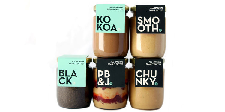
Frolic’s gourmet butters and spreads are adorned with bold flavor names that catch your gaze in an instant. Frolic’s logo, which is inspired by a ferris wheel, subtly appears in the corner of the text to reinforce the playfulness of the brand.
This UK supermarket rebranded their herbs in an attempt to boost sales and encourage people to get back in the kitchen to enjoy cooking. The tabloid style typography expresses the brand’s personality with animated suggestions like “dress up with drinks” and “pair up with peas,” showing how the brand’s products can be a lively addition to any meal.

Need More Package Design Inspiration?
Want to learn more about how package design can help your brand stand out from the crowd? Check out this post: 5 Coffee Brands With Perfect Packaging.
Photos courtesy of: The Dieline, BevNet, Frolic, Lovely Package & Eighthirty
