The Best Email Design Trends in Our Inbox Right Now
This has been a year of Snapchat, AI, VR, and video. Video. VIDEO! It hasn’t been easy for marketers to keep up with every trend gracing their screens. But one thing that continues to surprise creatives everywhere is the resilience of email marketing.
And by “resilience” I mean email marketing is still seriously kicking ass. Campaign Monitor reports that “you are six times more likely to get a click-through from an email campaign than you are from a tweet.” Email is 40 times more effective at acquiring new customer than Facebook or Twitter. And, at 66 percent, email continues to have the highest conversion rate, when compared to social and direct mail. Oh, and did we mention that email marketing has an ROI of 3800 percent?
To make the most of this trend upward, however, it’s important that you follow email design trends, and that your copy remains minimal and fresh. And in the name of all that is holy and nutmeg-flavored this holiday season, make sure you segment your audiences.
8 Holiday Email Design Trends You Need to See
Your inbox is generally pretty flooded with emails this time of year. But while sifting through your inbox trying NOT to take advantage of “buy 1, get 18 free” deals that make Joseph A. Bank look like Scrooge, you might also notice that it’s a great time to see the design trends that have ruled the past 12 months.
So without further ado, here are the best holiday email design trends in our inbox right now.
1. Urban Outfitters Goes Bold
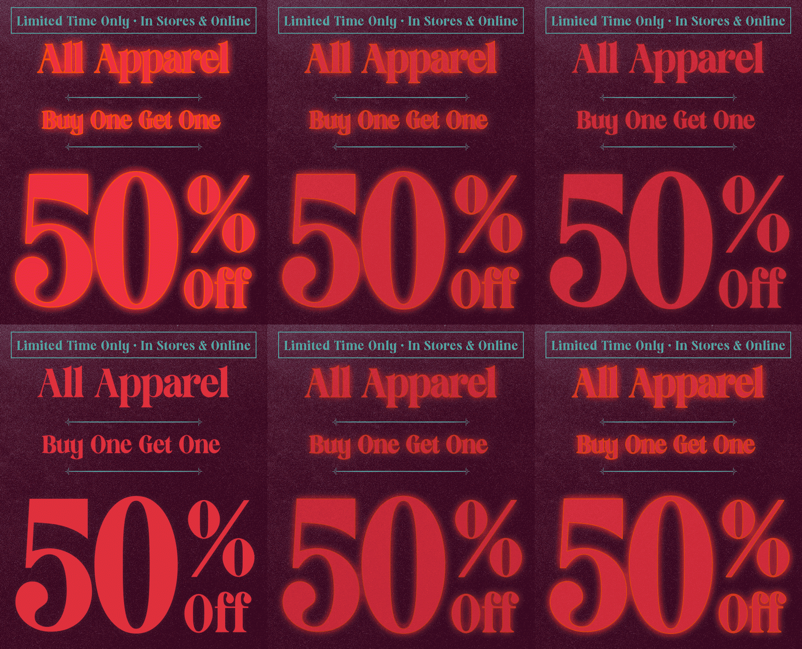
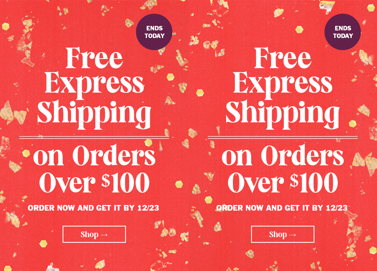
Gifs made their way out of our annoying coworkers emails and into our favorite brands this year. And the results were surprisingly delightful and fresh. Urban Outfitters incorporated a little bit of movement into their holiday campaigns. But we’re mostly in love with the big, bold fonts, straightforward CTAs, and non-holiday, holiday colors that made their emails a breeze to open this year.
2. CB2 Goes Ruff
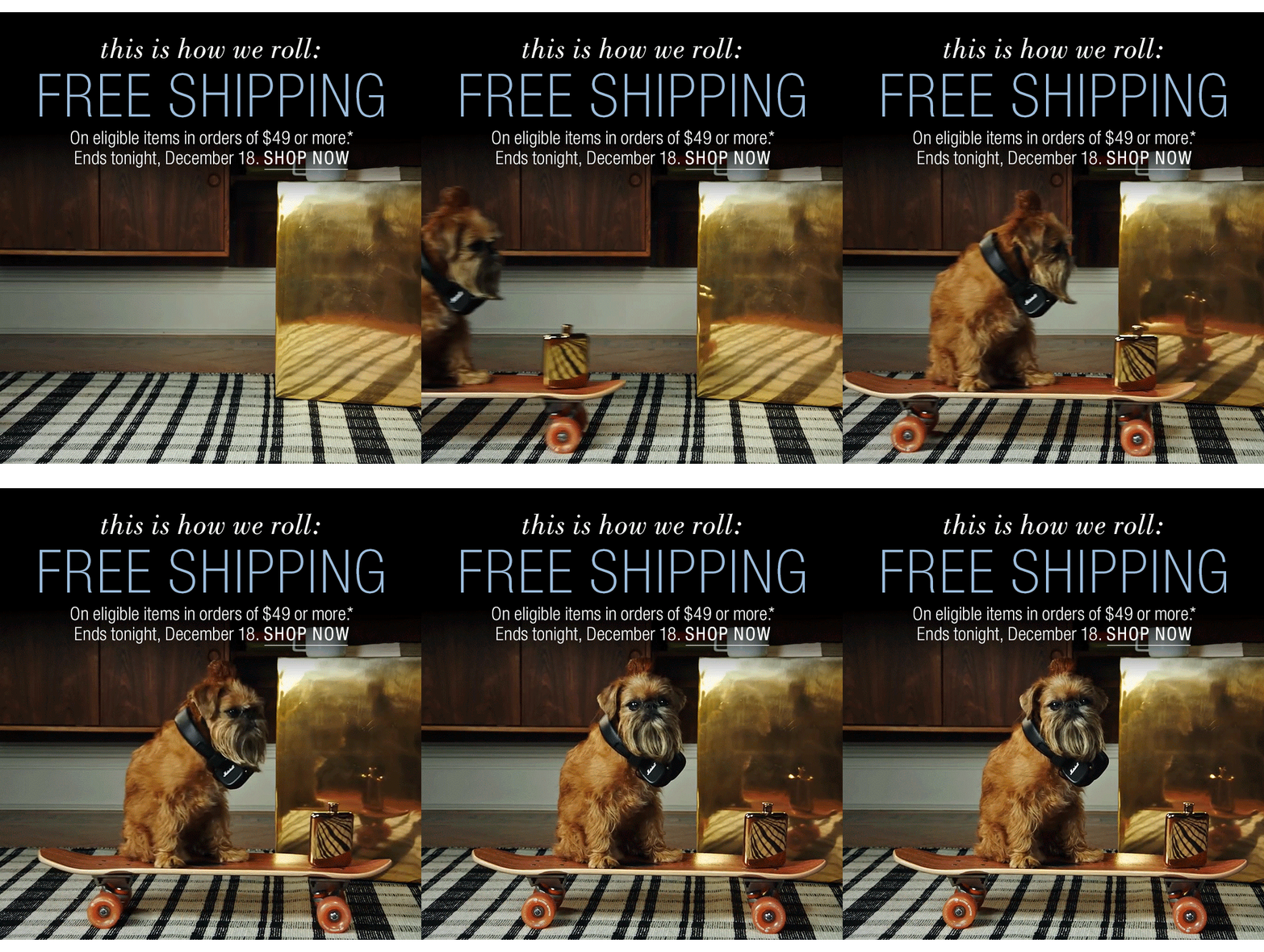
Want to get people to forward your emails to their friends? Put an adorable dog in it! Barkbox has already proved that having a dog as your brand voice is a smart strategy. This email, from mod furniture purveyor CB2, takes a page from the Barkbox book and pairs a furry friend with the simple tagline, “this is how we roll.”
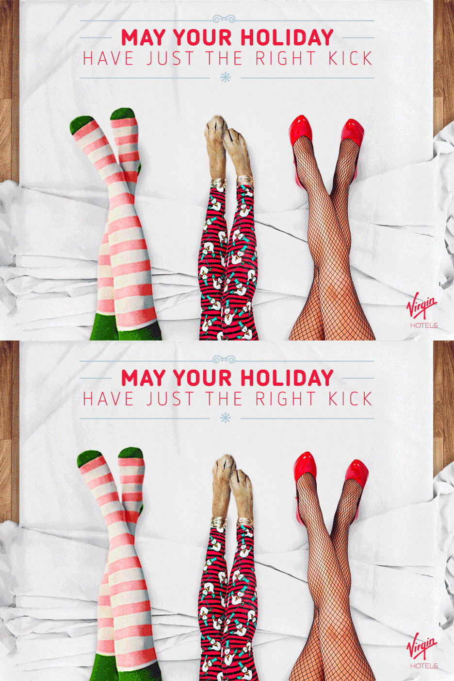
3. Virgin Goes Cinemagraph
While not as prevalent as gifs in 2016 marketing campaigns, cinemagraphs had a moment. We loved seeing them pop up in the always-cool marketing efforts of Brandfolder customer Virgin Hotels. Festive, a little weird, and accompanied by punchy copy, this was one of our favorite emails of the year.
4. West Elm Goes Soft
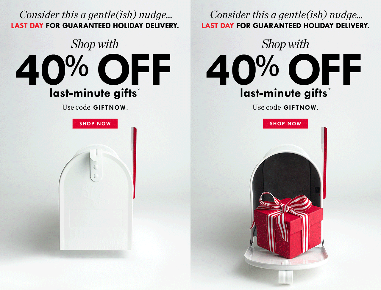
In the midst of a season where 90% of your emails greet you with loud statements or desperate warnings (i.e., “Don’t wait! This deal expires in literally 5 minutes and if you don’t make the most of it, you’ll regret it for 365 days!!), we appreciated the “gentle(ish) nudge” from West Elm. Sure, it’s partnered with urgency and a bold offer, but the overall feel of this email is friendly. It also models the minimalist design trend that was so prevalent in emails this year.
5. Howies Goes Handmade
We loved seeing the handmade touches in emails this holiday season. Colorful and a little more personal, Howies kept things simple with one big statement image and simple copy this year. The effect was enough to set them apart from the rest of the gif-laden offerings in our inbox. It was also a nice change from email photography that appears two plastered smiles away from stock photo territory.

6. Litmus Goes (Info)Graphic
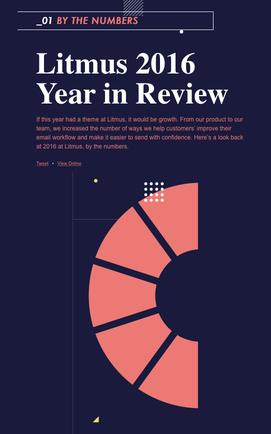
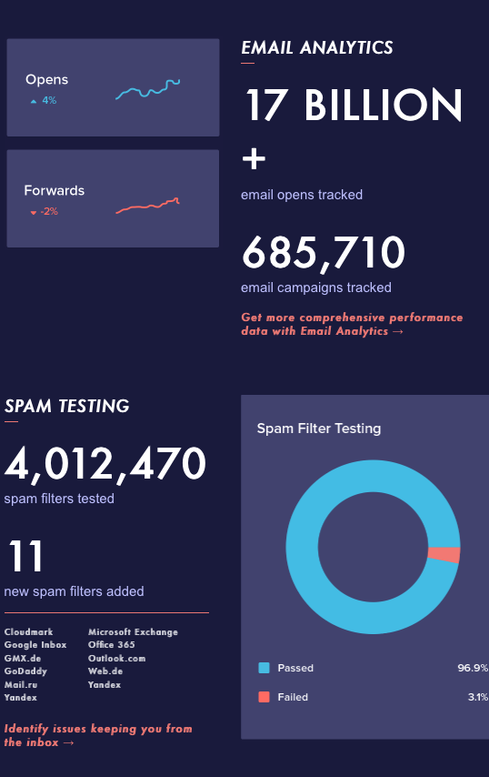
Parallax and all-infographic-everything were two big trends in 2017. We loved seeing these two trends combined in Litmus’ “Year in Review” email. It’s eye-catching, interesting, and packed with great information. It also relied heavily on recent data that says people don’t mind the long scroll.
7. Outdoor Voices Goes Review Reliant
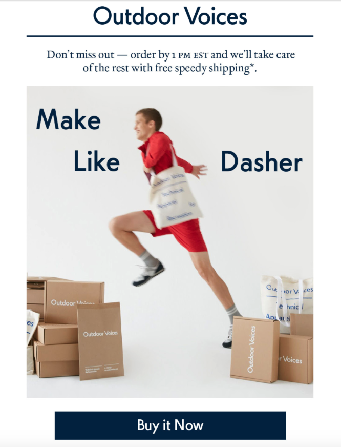
61% of consumers read online reviews before making a purchase decision. So why wouldn’t you put reviews right in your emails? That’s what Outdoor Voices did in their holiday campaign this year. In fact, reviews count for almost all of the copy in the first email listed here. It builds trust, and validates your audience’s curiosity even before they click through — you’ve already provided value!
8. Brandfolder Goes Video
We know, we know. It’s not the most visually mind blowing email on this list. But we’d like to think that what it lacks in flair, it makes up for in substance. This year, Brandfolder got serious about video. Why? Because by 2019, it’s estimated that 80 percent of all consumer internet traffic will be made up of video. It’s also expected that businesses will spend nearly $13 billion on video by 2018.
To meet the growing demand that video requires, we released Brandfolder’s Advanced Video this year. A few months later, we put out this eBook, all about how to create a killer video marketing strategy. Want to get ready for 2017? Download the free eBook today.
