
Get branding tips and expert advice delivered straight to your inbox.
This is the New Blog Template [TEST]
How to format the content in the new blog template
This new blog template has all the fields that were there previously plus some additional fields. The additional fields are: Optimized Video Slug/s, Header Gradient, and Redirect Slug. You no longer need a header image and instead a gradient background replaces the image. The default header gradient is purple popsicle to aster. Also you no longer need to add a meta image since this will default to the resource card image. However, you can add a custom meta image and that will override using the resource card image. This template pulls the h2 headers into the sidebar as navigation. If there are less than 2 h2 headers than the sidebar navigation sections will not appear.
Blockquotes
Use the greater than caret > to make a blockquote. Within the blockquote if you want to italicize the quote you will wrap the copy in opening and closing asterisks *. If you want to have the quote author on a new line you can use <br/>.
Quote Example:
"Brandfolder has paid for itself because as strategic marketers, it saves us from working on administrative work and enables our partners to access assets whenever they want."
— Anthony Nguyen
Quote Italicized Example:
"Working with Brandfolder's product, sales, engineering and customer support has proven to be very collaborative. We appreciate their willingness to incorporate features into their platform that are critical to our customers."
— Peter Orlowsky, Senior VP of Partnerships
Tokenized Videos
Create the VideoToken content and then you will use the video slug as the video token in <optimizedvideo-slug />. Don't forget to add that slug to the Optimized Video Slug/s field. If there are multiple videos in the blog you can paste the slugs in a list, separated by commas and no spaces between the slugs.

Full Width Images with Source Text
For full width images you just need the CDN url. The max-width of a full width image is 600px. Add the <figcaption> right below the image CDN url. The <figcaption> tags are already styled to center the source text below the image.
Image in Markdown
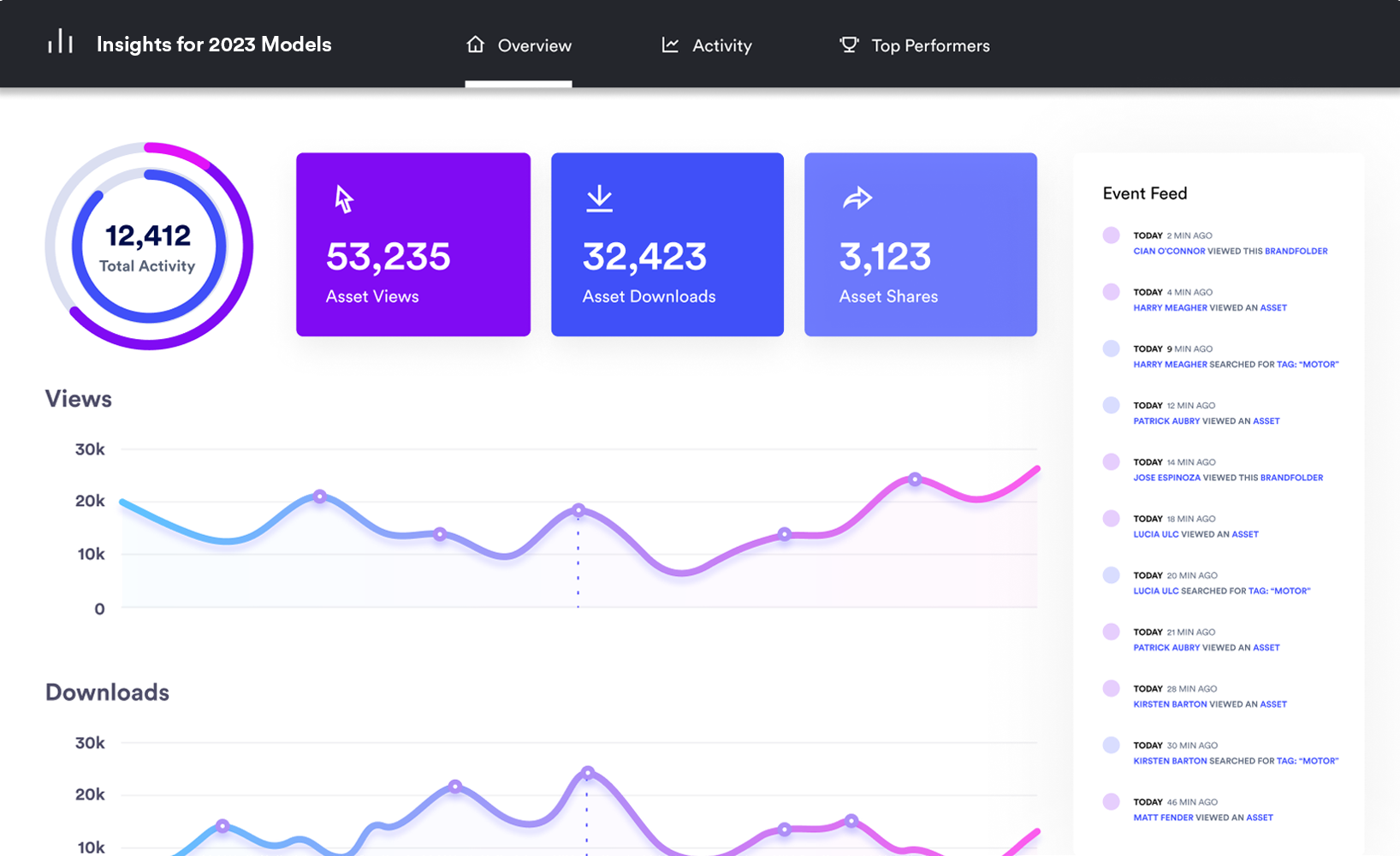

Image with Source text in a <figcaption> tag
<figcaption>Source: Brandfolder</figcaption>
Image with Source link in a <figcaption> tag

<figcaption>Source: <a href="https://brandfolder.com/home" target="_blank">Brandfolder</a></figcaption>
Image Link
[](https://brandfolder.com/integrations/)
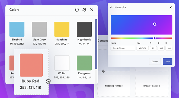
Images floated to the side
This is an example of an image that is floated to the right taking up 50% of the width. By adding "float-right-half" as the title attribute in the image this associates CSS in the code that floats the image accordingly.

This is an example of an image that is floated to the right taking up 50% of the width. By adding "float-right-half" as the title attribute in the image this associates CSS in the code that floats the image accordingly.
This is an example of an image that is floated to the right taking up 50% of the width. By adding "float-right-half" as the title attribute in the image this associates CSS in the code that floats the image accordingly.
This is an example of an image that is floated to the left taking up 50% of the width. By adding "float-left-half" as the title attribute in the image this associates CSS in the code that floats the image accordingly.

This is an example of an image that is floated to the left taking up 50% of the width. By adding "float-left-half" as the title attribute in the image this associates CSS in the code that floats the image accordingly.
This is an example of an image that is floated to the left taking up 50% of the width. By adding "float-left-half" as the title attribute in the image this associates CSS in the code that floats the image accordingly.
This is an example of an image that is floated to the left taking up 50% of the width. By adding "float-left-half" as the title attribute in the image this associates CSS in the code that floats the image accordingly.

This is an example of an image that is floated to the right taking up 30% of the width. By adding "float-right-one-third" as the title attribute in the image this associates CSS in the code that floats the image accordingly. This is an example of an image that is floated to the right taking up 30% of the width. By adding "float-right-one-third" as the title attribute in the image this associates CSS in the code that floats the image accordingly.
This is an example of an image that is floated to the right taking up 30% of the width. By adding "float-right-one-third" as the title attribute in the image this associates CSS in the code that floats the image accordingly. This is an example of an image that is floated to the right taking up 30% of the width. By adding "float-right-one-third" as the title attribute in the image this associates CSS in the code that floats the image accordingly.

This is an example of an image that is floated to the left taking up 30% of the width. By adding "float-left-one-third" as the title attribute in the image this associates CSS in the code that floats the image accordingly. This is an example of an image that is floated to the left taking up 30% of the width. By adding "float-left-one-third" as the title attribute in the image this associates CSS in the code that floats the image accordingly.
This is an example of an image that is floated to the left taking up 30% of the width. By adding "float-left-one-third" as the title attribute in the image this associates CSS in the code that floats the image accordingly. This is an example of an image that is floated to the left taking up 30% of the width. By adding "float-left-one-third" as the title attribute in the image this associates CSS in the code that floats the image accordingly.
Image Carousel
Unordered Lists
An unordered list will have circle bullet points like this:
- Bananas
- Apples
- Grapes
You can create nested unordered lists by increasing the tabs
- Fruit
- Bananas
- Apples
- Vegetables
- Potatoes
- Corn
Custom styling
You can create copy that has a border around it. This is an example of what it would look like.
This is copy with a box border around it. You will need to add the "div" HTML wrapper tag with class="box-border" around the copy. Then you will need the copy wrapped around "p" tags in order to have it styled correctly.
1
This is a styled number with a circle around it. Use a "span" tag with class="block-number" and the number you want inside the "span" tags.
<span class="block-number">1</span>
1Definition
This is a superscript where the copy in the "*sup*" tag is raised higher than the baseline.
<sup>1</sup>Definition
This is an inline CTA with custom code. The "href" is the url that you would like to direct the user to go to.
<div style="margin: 40px auto; text-align: center;">
  <a class="button primary large" href="https://brandfolder.com/quote/" target="_blank">Schedule a Demo</a>
</div>
| Vegetables | Fruit | Protien | Dairy |
|---|---|---|---|
| Potato | Kiwi | Nuts | Milk |
| Bell Pepper | Apple | Chicken | Cheese |
| Onion | Grapes | Beef | Yogurt |
| Lettuce | Mango | Pork | Ice cream |
| This is going to be a really long header | This is a shorter header | Shortist header |
|---|---|---|
| Is this content going to wrap | what is this going to look like | Will the columns be even |
| Styling tables is hard | Especially making them responsive | Hope this styling works |
| This will be great to have tables | Tables will help visualize comparisons | Please work |