
Get branding tips and expert advice delivered straight to your inbox.
These Were the 8 Biggest Rebrands of 2019
Choose any company who’s stood the test of time, and chances are their brand identity looks different now than it did at its inception. As industries evolve and new generations become key audience segments, brands are forced to reinvent themselves in an effort to stay relevant.
In 2019, rebrands appeared to reach an apex. “It feels like we are witnessing a seismic shift in the sheer number of rebrands,” Matt Kandela, CEO of branding and design company Dear Future, said earlier this year. "One has to wonder if we’ve entered peak rebrand or if this is just the new normal.”
With 2020 right around the corner, we decided to take a look back at the full gamut of 2019 rebrands, and bring to you the most notable. A few key trends emerged—a shift toward flattened dimension in logos, and an inclination in expanding parent companies to unify under cohesive aesthetics, among others. The biggest takeaway? With technology, lightening-speed communication channels, and an oversaturated market, brands are reinventing themselves faster and more frequently than ever. So buckle up! Here, the biggest rebrands of 2019.
Reebok
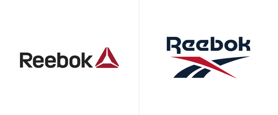
In November, Reebok introduced a refreshed version of their 1992 Vector logo and “drop-R” wordmark, a gentle nod to the power of interlacing nostalgia and reinvention. The goal of the rebrand was to unite Reebok’s many divisions under a single aesthetic. New York-based designer Darrin Crescenzi led the effort, reshaping the Vector’s curves and adjusting its spacing to modernize the logo while honoring its history. “Resurrecting the Reebok Vector logo satisfies every goal we set out to achieve,” says Crescenzi. “It’s beloved, dynamic, and looks amazing on footwear and apparel.”
And though the 2011 Delta logo will continue to appear on the apparel of select Reebok brands, the streamlined Vector represents the importance of bigger-picture brand consistency. “Under a unified banner, all of our products and experiences will tell a single story that is clear and consistent,” said Karen Reuther, VP of Creative Direction, in their press release.
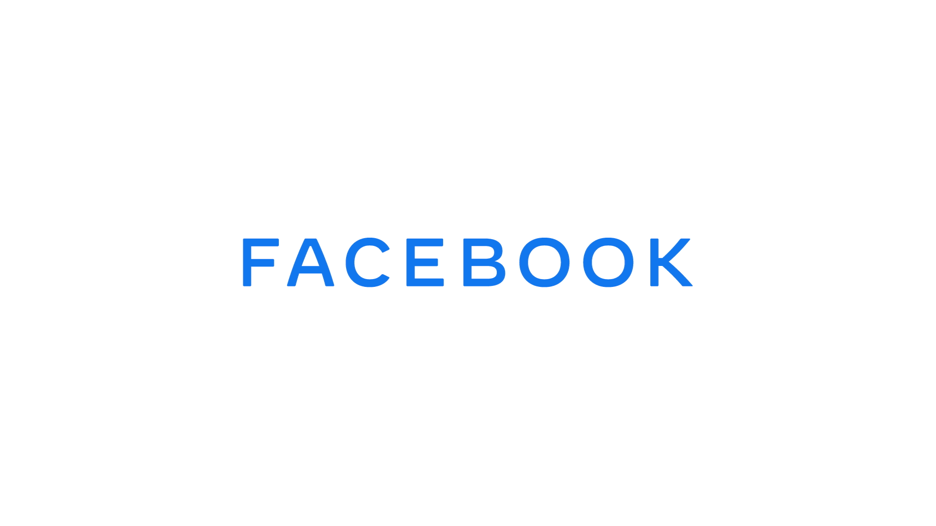
Facebook may have begun its climb to internet dominance with friends, pokes, and walls, but the company now boasts a full portfolio of social media apps. To clarify its broadening scope as a conglomerate, Facebook pushed forth a logo redesign—a simple, all-caps typeface with a shifting color scheme in reference to Instagram, WhatsApp, Oculus, Messenger, and more. “This brand change is a way to better communicate our ownership structure to the people and businesses who use our services to connect, share, build community and grow their audiences,” the company explains.
What’s especially clever about this rebrand is its simplicity. No need to reinvent the wheel with a new, umbrella identity; Facebook merely alludes to its platform suite with already identifiable brand colors.
Kroger
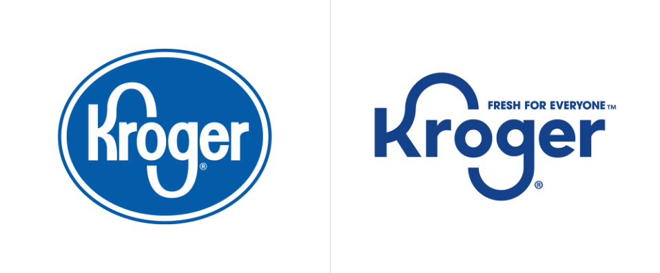
For a nationwide household name serving over 11 million consumers per day, rebranding is quite the undertaking. Kroger’s brand refresh remained faithful to its heritage—the company did not discard the “shape and movement of the iconic ‘K’ and ‘G’ loved by generations,” nor did they move away from their signature blue—but it also pointed to a clearer vision of inclusivity, customer service, and unity across Kroger’s 20+ retail banners with a new tagline, brand imagery, and stripped-down logo.
For longtime customers and unfamiliar consumers alike, this rebrand did well to put Kroger at the forefront of the conversation, and give shoppers a sense of freshness (a “fresh for everyone” kind of vibe, if you will). So how’d such a massive organization pull it off? It helps to have a Brandfolder!
Mozilla Firefox
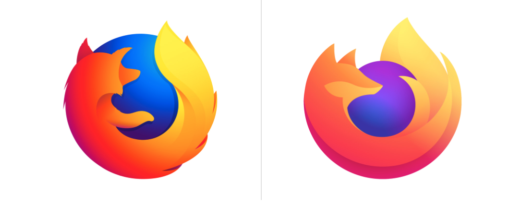
In June, Mozilla Firefox announced a full rebrand to match their evolving product line. Their new brand identity, which runs the gamut from refreshed logo to color palette to typeface, ushered in a new era for the company. “This my absolute favorite rebrand of the year,” Brandfolder’s Creative Director, Lucia Ulc, avows. “Firefox has had, in essence, the same logo for 15 years—a refresh was due. They finally broke up with the fox and introduced more warmth and sophistication into their brand. Happy to have this one on my dock.”
And the most powerful part of this rebrand? Firefox’s interest in audience feedback like Lucia’s. While most companies drop a rebrand as the final step in pursuit of fresh identity, Firefox sees no reason to consider this an endpoint. “As a living brand, Firefox will never be done,” their blog reads. “It will continue to evolve as we change and the world changes around us. We have to stretch our brand guidelines even further in the months ahead, so we’re interested in hearing your reaction to what we’ve done so far.”
PBS
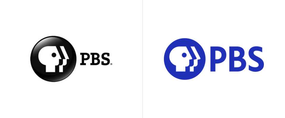
You remember it dearly, but you’ve gotta be honest—with Netflix, Hulu, Amazon Prime, and the like, PBS hadn’t really been top of mind lately. To compete in an increasingly-saturated digital landscape, the 50-year-old legacy network put forth an updated identity. The once glossy and 3-D logo icon is now flattened, cleaner, and boasts a new custom font.
Plus, it’s electric blue. “If Netflix owns red and Hulu owns green, PBS will own blue,” said CEO of Rocky Mountain PBS Amanda Mountain. Kudos to PBS for evaluating the market, adjusting to evolve in step with today’s trends, and once again stake a claim to decades-long entertainment authority.
Staples
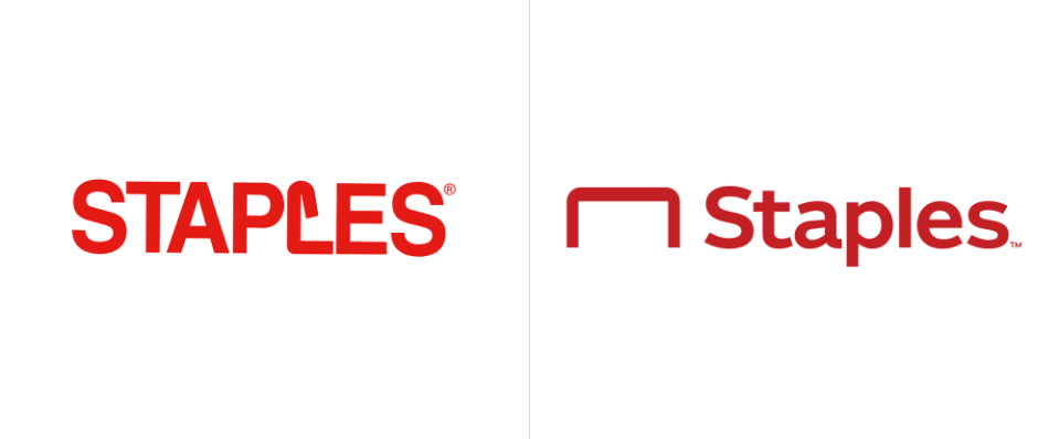
While the Staples rebrand was controversially received in the design community, it pointed to yet another inevitable symptom of the technological age in which we live—where can a bix box store dedicated to paper products and physical office supplies find its footing? In the satirical world of The Office, the answer might be to unapologetically push an outdated mission (“limitless paper in a paperless world,” anyone?). For the marketing team at Staples, however, a full reinvention of brand aesthetic and brand identity was in order.
Visually, Staples took their iconic bent-staple L and pulled it out in front of their wordmark. As Brand New’s Armin Vit points out, “it gives them an icon to work with, something they didn’t have before.” Staples also looked to reposition themselves in the market, identifying now as a “worklife fulfillment company, ” to boost awareness around their expanded array of product lines. “Today’s workplace is evolving and so is Staples,” said Marshall Warkentin, Chief Marketing Officer.
VW
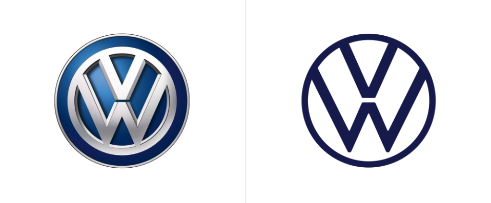
Out with the chrome and in with the new. For VW, rebranding meant stripping down their legacy logo to highlight its essential elements, thereby ditching the three-dimensional chrome finishes their logo featured for years. The new aesthetic evokes a simple modernity, and, as the brand explains it, offers more versatility in how their creative can be featured in marketing efforts.
Along with their modernized design, VW looked to engage a larger target audience and shift the overall brand message. “The focus will be on people,” their press release reveals. “Volkswagen will no longer concentrate on perfectionism in vehicle photography.” And while the voice of Volkswagen has historically been male, it will now be female. This update in brand positioning marks a positive step forward in the greater scheme of consumer interests, and VW’s intent to establish a broader sense of audience inclusivity.
Slack
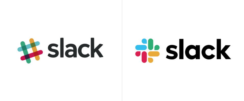
When Slack announced their rebrand at the beginning of the year, they knew they were replacing what many considered a simple, easy-to-identify logo. The problem was, it wasn’t actually that easy to use accurately. The 11 colors of their pound sign icon distorted depending on their background (check out the most egregious examples here), and the solution at the time was to develop a few different versions of the logo to serve various purposes.
Still, the Slack brand identity lacked cohesion. With their new, all-encompassing logo—one that still has the essence of an octothorpe without being one literally—serves to unify their brand visuals, simplify that pesky color palette, and ensure brand consistency moving forward.