- What Is a Brand Style Guide?
- What Is the Importance of a Brand Style Guide?
- What Is Included in a Brand Style Guide?
- How to Create a Style Guide for Your Brand
- Sample Brand Style Guide
- Mistakes to Avoid When Creating a Brand Style Guide (and How to Address Them)
- Getting Started with Your Brand Style Guide
Get branding tips and expert advice delivered straight to your inbox.
To create strong branding — and, by extension, to succeed — companies need to implement brand style guidelines that keep image and messaging on track. Use this step-by-step guide to develop brand guidelines that set up your business for success.
Included on this blog, you’ll learn why a brand style guide is important and how to create brand guidelines. You’ll also find examples of common, real-world branding mistakes and how to avoid them.
What Is a Brand Style Guide?
A brand style guide outlines how to present a brand to the world. It should include the company’s mission, fonts, colors, logo guidelines, and personality. A style guide helps ensure consistent messaging through all forms of engagement. Typically brand style guides are largely informed by comprehensive information found in a company’s brand guidelines.
The brand style guide is usually created by a designer, who will work closely with key stakeholders to determine the brand’s identity. A good style guide should be only as long as necessary and conform to the style of the brand that it describes.
For some examples of style guides for particular industries, check out our roundup of brand guidelines.
What Is the Importance of a Brand Style Guide?
A style guide is important because it ensures consistent messaging. This practice helps create a brand identity, increases brand recognition, and ultimately leads to a more successful business. Any large company in the market has a carefully considered brand style guide.
Kyle Eberle, Senior Product Designer at Peacock TV, explains the importance of a brand style guide. “A style guide provides an identity framework for your brand. It enables the various teams in an organization to tell a consistent story or offer a new feature that's on-brand. Without a clear guide to unite group efforts and messaging, strategy, and execution won't be as effective.”
Brand style guides are important for a number of reasons, the most important of which we’ve rounded up below:
- Consistency: Consistent messaging across multiple platforms, multiple designers, and marketing campaigns builds brand identity and trust in your products. - Quality Control: A brand style guide creates an easy way to check at a glance that new material conforms to an existing brand identity. - Brand Recognition: Using the same fonts, colors, and photo styles ensures a brand is recognizable immediately. - Brand Identity: A brand identity gives consumers an idea of what to expect when they interact with the brand. A brand that has an established identity is more approachable than one that does not. - Success: Implementing all of the above around a brand identity improves a company’s chance of success through increases in sales and word-of-mouth advertising.
To learn more about brand stories, check out our collection of free brand story templates.
What Is Included in a Brand Style Guide?
A brand style guide includes a brand’s colors, fonts, logos, and personality, as well as detailed instructions for how to use them. The guide should be easy to read and informative, but not repetitive. A good style guide should also follow the brand guidelines.
“A style guide should include all the design elements that make up a brand including font, color, shape, buttons, interaction style, tone of voice, imagery, etc. It should cover every aspect of the look and feel of your brand. It should also be self-explanatory and easy to scale for future contexts and use cases,” explains Eberle.
Dmytro Biliur, a freelance user experience designer who has worked with Birch Coffee, Oiche Furniture, and Port Prerogative Club expands on this idea: “A style guide is more than just a set of rules. It is about setting a language for aesthetics that will evolve along with the product. Even after an engagement with a client is over, the style guide serves as a living, growing document to help guide further digital growth efforts.” You should include a brand style in your brand brief any time you share it with a new client or designer.
A successful brand style guide includes all of the following:
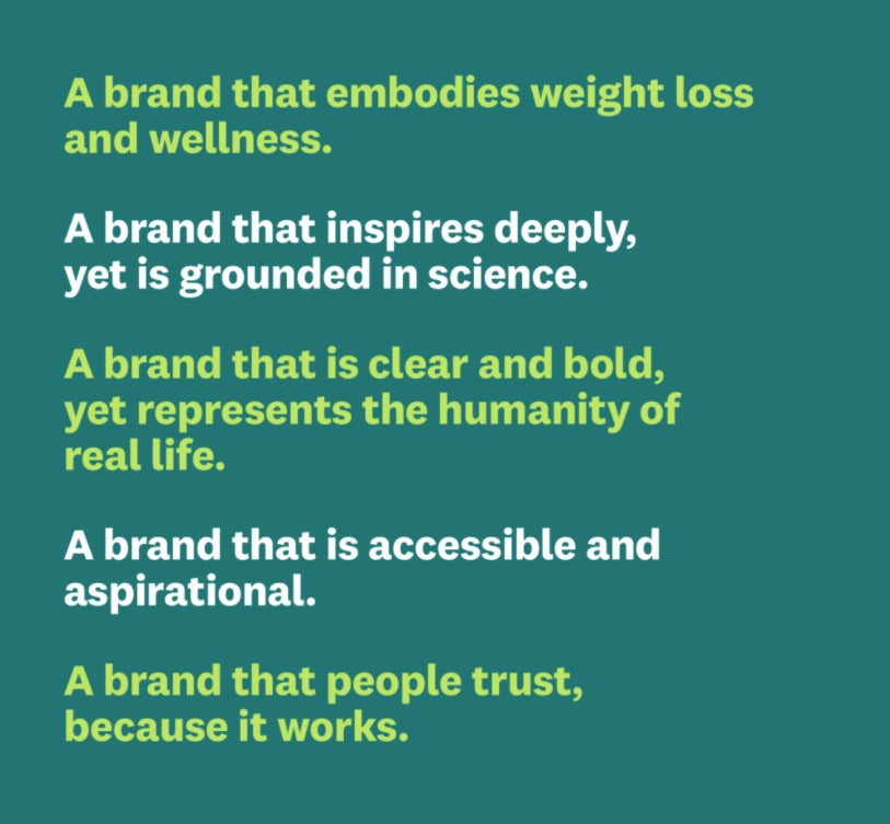
- Mission and Vision: A strong mission and vision should include your target audience, personality, and the values that make up your brand pillars. See the Weight Watchers brand guidelines for an example of strong mission and vision.

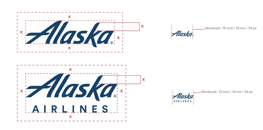
- Logo Guidelines: Effective logo guidelines should include the minimum size, examples of approved colors and reversals, and how to use the logo with and without text. Take a look at the Alaska Airlines style guide for examples of how to use a logo.
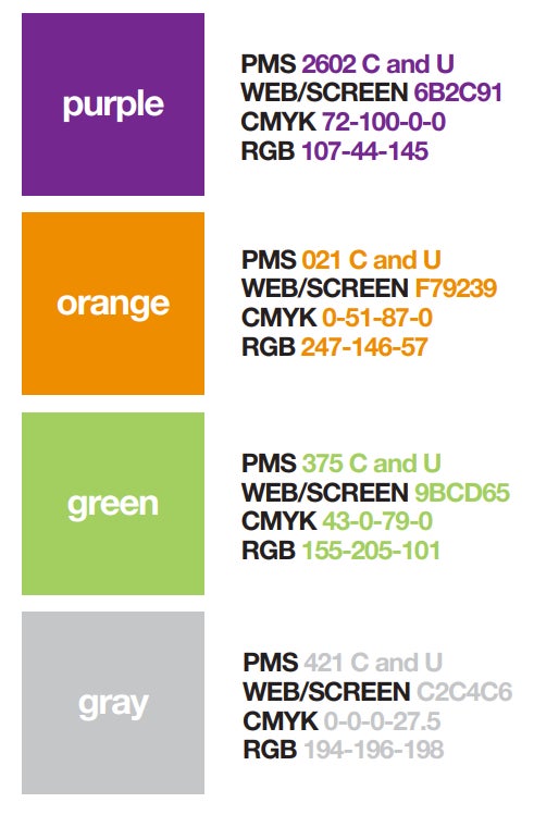
- Color Palette: A color palette is a useful tool to help you identify your colors and understand how to use them together. We reccommend listing your colors in Pantone or by color code to ensure people use the correct hues across platforms. The ASPCA brand guidelines are a comprehensive way to identify colors.
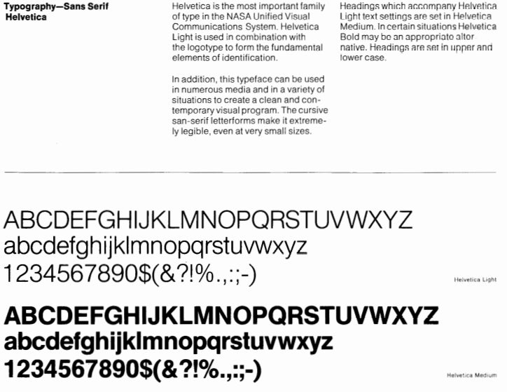
- Typography: Typography guidelines help your team to name your brand fonts and outline how people should use them. We reccommend making note of any special kerning requirements, as well as how to use font styles such as bold and italics, if relevant. See the NASA style guide for an effective example of describing font use.
- Image and Photographic Style: Helpful image and photographic guidelins should give examples of the types of lighting, color palettes, and activities that photographs advertising your brand should use. Check out the Petco Foundation’s brand guidelines for examples of photographic style.

How to Create a Style Guide for Your Brand
A style guide is a document that serves as a roadmap to the expression of your brand. To create one, first identify your company’s goals. Choose fonts, colors, and a logo that represent those goals. Then create a brand identity to share.
Biliur explains the importance of allowing your style guide to evolve with your brand. “In many cases, mistakes happen when a company creates too detailed of a style guide too early in the lifetime of a brand. A style guide has to grow together with the brand. It should be a living document capable of change as the company grows.”
1. Identify company goals and mission.
Lay out your company goals and mission clearly and concisely. This area may also be where your brand’s personality shines through. Notice in this Weight Watchers example that the mission is clearly stated and that it suggests the brand personality in words like “clear,” “bold,” and “aspirational.”
2. Create logo guidelines.
Create a good logo that is identifiable at many sizes, in print and digitally, and captures your brand’s essence. In your style guide, identify the minimum and maximum sizes at which people should use your logo, how to use it in print versus digitally, and which colors are acceptable.
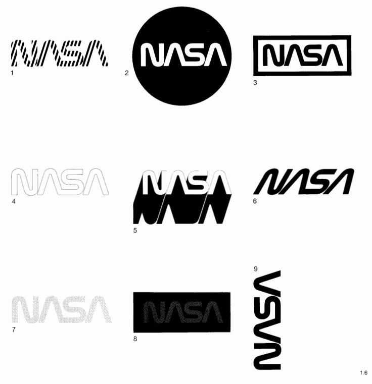
“Sometimes style guides can be too focused on very specific use cases which are outdated or irrelevant. For example, it might show logo usage for print but nothing for digital,” says Eberle. Many successful style guides also include explicit instructions on how not to use a logo, such as the NASA example.
3. Determine a color palette.
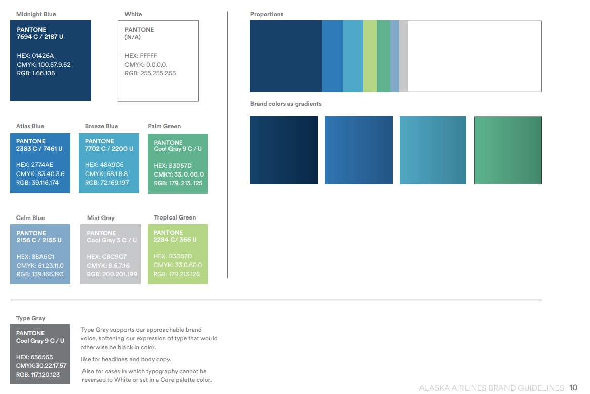
Include swatches for each color associated with your brand, as well as Pantone and color codes. Some brand guidelines, like the Alaska Airlines example above, also include gradient examples and proportions for use of each color. You may also find it beneficial to include which colors designers can use together, or identify which hues to use as accents.
4. Choose your fonts.
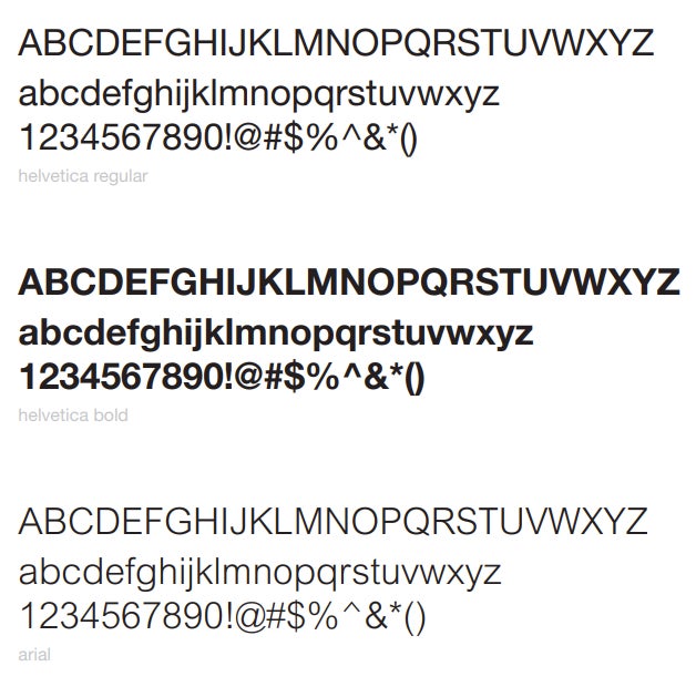
Pick a font that is easy to read digitally and in print. Include images of the fonts in capitals and lowercase, as well as identifying any unique kerning or bold and italics use cases. This ASPCA example highlights two fonts and provides an example of one that may be used in bold.
5. Include examples of photographic style.
Show how to place products in photos, the lighting and color palette of photos, the use of any warm or cool filters, and how to place a logo within photos. The Petco Foundation also includes a section on what types of photos not to use, which can be just as important!

6. Create a document and share it.
Adhere to your brand guidelines when you create your own guidebook. Your guidebook then becomes an example of the type of branding other people should use when they share your brand. To learn more about sharing your branding with others, take a look at our collection of free brand presentation templates.
Sample Brand Style Guide
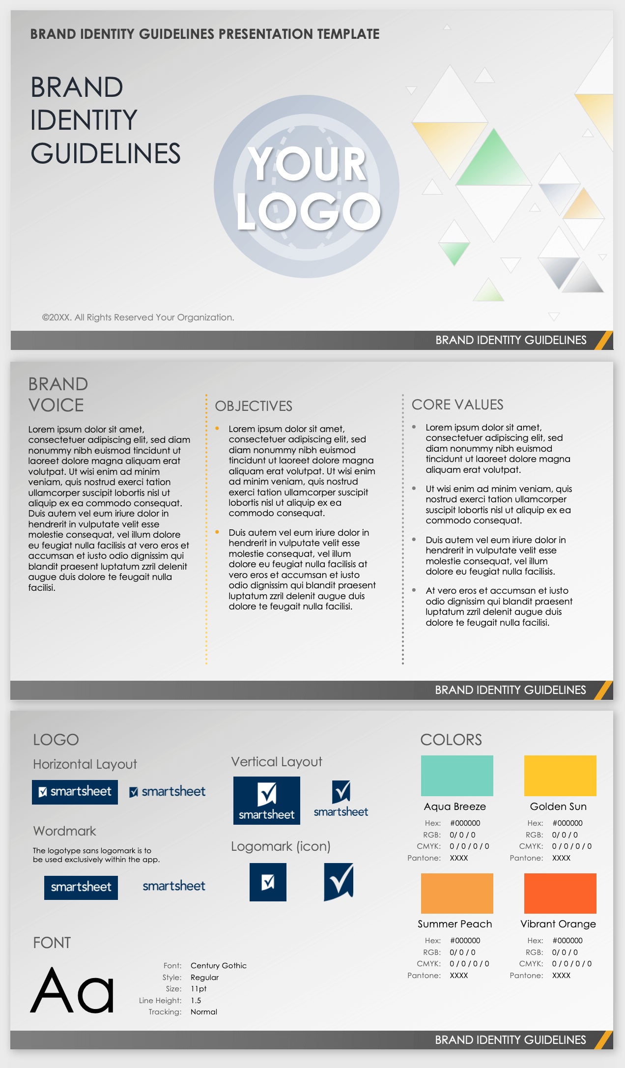
A brand style guide is an integral tool for brand management. Every company, big or small, should consider creating its own brand style guide. The slides feature visual and non-visual elements that you can use as a starting point for developing your own brand standards. To create your own, download a free brand style guide template to help you get started.
Mistakes to Avoid When Creating a Brand Style Guide (and How to Address Them)
With so many style guides in the world, you’re bound to see some common mistakes. We’ve gathered a few of the biggest, from mixed messaging to poor logo design, and provided tips for combatting each.
“Style guides are often created with little to no attention to detail: logos with no meaning; color choices are made based on personal preferences only, with no understanding of the psychology behind them; poor typography and imagery; absent hierarchy and clunky layouts. The list can go on forever. It all leads to the worst result — inconsistency,” warns Biliur.
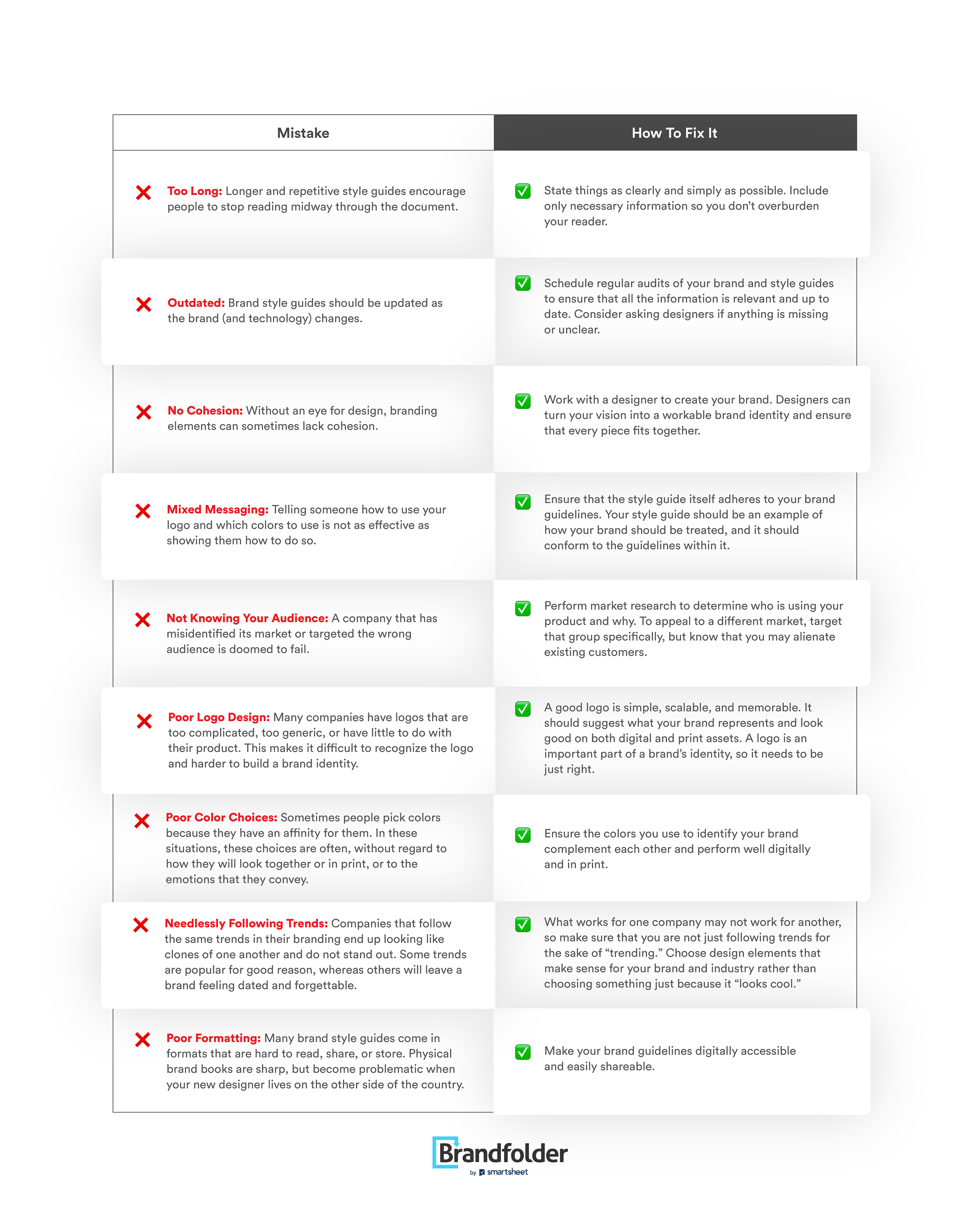
Real-World Examples of Company Mistakes in Branding Style Guides
Even the most professional companies make mistakes in their brand style guides. We’ve collected some examples of actual style guides issues, from broken image links to repetitive information, so that you can avoid making your own.
- Broken Image Links: The Olaplex style guide contains numerous images, all of which appear as broken links on the page. It is vital to check your website for broken links and to update image links when they don’t work.

- Text-Only Logo Guidelines: These Olaplex logo guidelines are thorough, but do not include any visual examples of the logo or how to use it. This presentation is much less effective than a more visual model that shows how the logo should and should not be used.
“One common mistake I have seen companies make is when a brand has a style guide, but doesn’t use it,” says Biliur. “Olaplex could easily use this space to demonstrate its branding while showing you how to use it.”

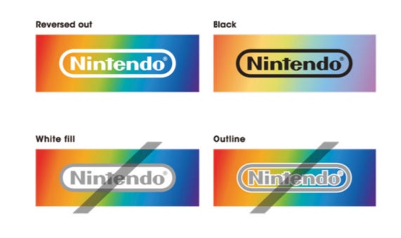
- Repetitive Images and Information: Nintendo’s brand style guide is solid overall, but includes the same images and information on different pages. This second mention about fill and outline is redundant and does not need to be included twice.
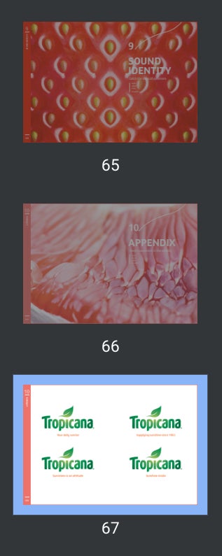
- Excessive Length: Tropicana’s brand style guide runs a whopping 67 pages, many of which are filled with minimal or repetitive information. This image shows three pages from it’s guide, all three of which are minimal and devoid of any real new information. Tropicana’s guide is extremely thorough and does many things right, but its style guide would be more effective, and more likely to be read in its entirety, if it was more concise.
- Typos and Incorrect Word Usage: The Dove Healthcare brand style guide includes multiple instances of typos and incorrect verb tense. Make sure to edit your documents carefully before you share or post them.

Getting Started with Your Brand Style Guide
When created with intentionality and purpose, brand style guides can be incredibly useful tools for creating and maintaining strong branding. We hope this step-by-step guide has been a helpful resource to help you get started.
If you’re looking to continue learning more about branding, check out our ebook: How to Keep Campaigns On Brand and On Schedule.
