Get branding tips and expert advice delivered straight to your inbox.

You have many elements to consider when creating your brand guidelines, from logo usage instructions to mission and vision statements to the overall layout of your guidelines.
We’ve collected a list of the top example brand style guides, sorted by industry, and asked the experts about the best and worst components of each. We list each brand side by side to highlight their major successes and missteps.
What Are Brand Guidelines?
Designed to keep brand messaging consistent across platforms, brand guidelines dictate how a brand’s name and assets should appear to the public. Brand guidelines usually include information about logos, fonts, and colors, and clearly communicate the brand’s personality.
Sometimes called a brand manual or brand handbook, brand guidelines generally exist as a book or document for distribution to designers, or anyone using the brand’s assets for marketing or design purposes. To learn more about creating a brand style and guidelines, see our guide to developing brand guidelines.
Dmytro Biliur, a freelance UX designer, shares his understanding of brand style guides: “It’s a master set of rules or guidelines for communicating a brand. Style guides are created to share all of the standards required to represent a brand. Having a style guide ensures visual and functional consistency of all the elements associated with a brand, especially when an external party handles the design.”

Top Brand Guideline Examples
Brand guidelines come in many forms, from organized, utilitarian documents to interactive websites and printed handbooks. We’ve analyzed the essential sections of brand briefs from various industries and asked our experts to weigh in on their effectiveness. Below, you’ll find analyses of the brand guidelines from the following companies:
- Media and Social Media: Twitter - Retail: Walmart - Food and Beverage: Starbucks - Technology: NVIDIA - Entertainment: Hulu - Travel: Delta - Public Services: BART
Example Brand Guidelines for Media and Social Media

More than 3.5 billion people used social media in 2020. As competitors in a major global industry, social media brands need to be accessible and identifiable to an extensive subset of the population. Twitter, one of the leading social media companies in the United States, uses cohesive and simple brand guidelines. Below, we’ve outlined some of the key strengths and weaknesses of Twitter’s brand guidelines.
The guide itself adheres to the company’s branding but doesn’t include some of the basic sections of other more comprehensive style guides. Twitter does a lot of things right. Its logo guidelines, guideline structure, and thoroughness regarding typography all clearly communicate a cohesive visual style:
- Logo Guidelines: Twitter’s logo is well designed and recognizable. The guidelines provide multiple examples of logos for different use cases and minimum sizes for all of them. They are also clear about what not to do with the logo, providing many examples of incorrect use.
- Overall Layout: Twitter keeps its brand guidelines concise, which makes the guide clear and easy to digest.
“The Twitter guide is good at condensing information to lessen the cognitive load and really focus the user as they scroll,” says Kyle Eberle, Senior Product Designer at Peacock TV. “The layout conveys brand usage clearly, with labels and descriptions on the left and visual examples on the right. By keeping this consistent template throughout, readers make it through the document faster with fewer questions.”
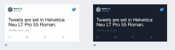
- Typography and Brand Usage Guidelines:__ Twitter specifies Helvetica Neue as the standard font to use when citing actual tweets in marketing materials and has a clear, concise guide for using “Twitter marks,” such as the Twitter name and logo. “The amount of information shown, and the number of pages, is spot on,” notes Eberle.
There is, however, key information missing from the guideline, including color specifications, a mission statement, and instructions for using photography:
- Color Identification: Twitter does not provide a color code for its brand color, instead calling it “Brand Blue.” However, the company is very clear about color use and clarifies that designers may only reproduce the logo in Brand Blue or white.
- Mission and Vision Statement: Twitter does not include a mission or vision statement in its brand guidelines. Instead, the conversational tone of the guide suggests an approachable brand personality. The guide itself acknowledges that it is intentionally short, and Twitter has included contact information so designers can reach out with questions on missing items.
For help creating a cohesive mission statement, check out this list of free brand story templates.
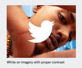
- Photographic Guidelines: Twitter does not provide photographic guidelines in its brand guide, but it does provide one example of an image used with its logo. A designer may need to reach out to Twitter directly to determine acceptable use cases beyond this example.
Eberle suggests additional changes that could strengthen the Twitter brand guidelines and make them more user-friendly. “One thing I would change,” he says, “is making the image sizes of each page a little shorter to reduce the amount of scrolling. I'd also remove the presentation deck stylings as the repeating Twitter logo in the corner is distracting and unnecessary. I doubt anyone forgets they're looking at a Twitter document while they're reading it.” For examples of and tips for putting together a brand presentation, see our list of free brand presentation templates.
When asked about special considerations when creating or sharing a brand kit for social media, Eberle remarks, “I see no reason to treat a social media guide differently from any other public-facing brand guide. They convey the same kinds of information, just within different contexts.”
Example Brand Guidelines for Retail
Walmart is the leader in U.S. retail sales, making its’ branding incredibly important. As a result, Walmart has one of the best examples of brand guidelines in the business, with a deliberate but friendly approach to its manual.
Grace Desmarais, a freelance illustrator and designer, weighs in on the overall impact of Walmart’s brand guidelines: “It is very thorough. Any questions you could possibly have about the brand are answered in this brand kit. There are examples of dos and don'ts, which is always helpful when trying to create something original from a branding perspective.”
Below, we’ve outlined some of the key strengths of the Walmart brand style guide that help clearly communicate brand usage standards:
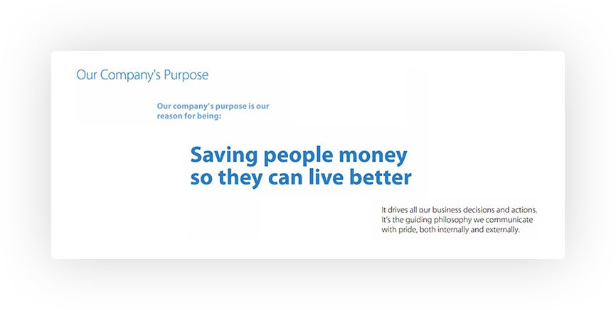
- Mission and Vision Statement: Walmart clearly defines and communicates its mission in the brand guidelines. The mission statement sets the tone for the rest of the guide, and is impactful because it is straightforward and has universal appeal.
To learn more about creating a successful brand strategy, we’ve compiled a list of free brand strategy templates.
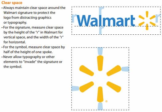
- Logo Guidelines: Logo guidelines in the Walmart brand style guide are extensive. These guidelines outline proper uses across numerous use cases, appropriate spacing, and proper use of the logo with retail taglines. Walmart leaves nothing ambiguous, which helps to ensure consistency across platforms.
“Walmart has undergone a variety of logos and design changes over the years,” says Desmarais. “It addresses this in its manual, which is key when you are working on an international scale with retail as your market. It is important to know where the brand came from so that you know where to take it.”
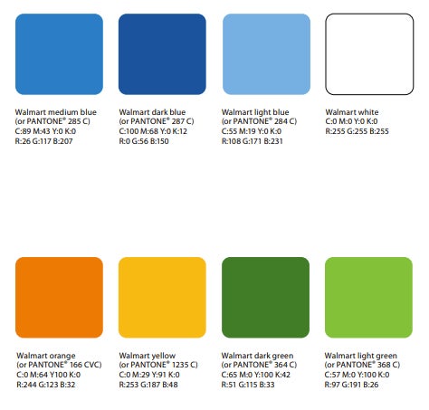
- Color Guidelines: Walmart identifies its colors numerous times in this guide, but not in a way that feels repetitive. The company clearly identifies all acceptable colors, notes which colors to use in which circumstances, and specifies which colors should or should not be used together. In addition, it explains why each color was chosen, which further communicates a clear brand identity to the reader. Also included is an intuitive pie chart that denotes the ratio of colors that should be used on branded materials, a hallmark of a thoughtful and thorough guide.
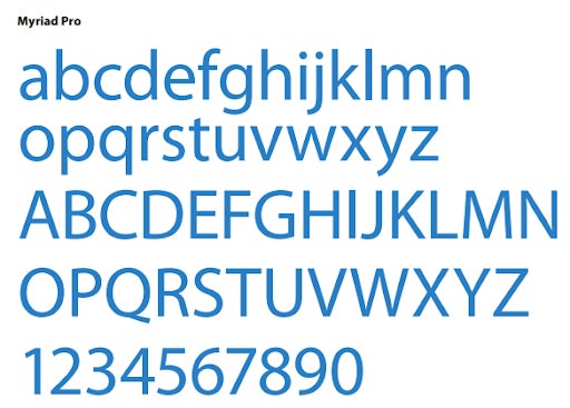
- Typography Guidelines: Walmart provides the name of its font, a download link, and an example of all letters and numbers in that font. In addition, it offers examples and use cases for different styles of this font, such as italics, bold, and light, so that designers have all the necessary information to create images consistent within the Walmart brand.
While the Walmart guide is an excellent example of clear, comprehensive brand guidelines, the company could offer clearer and more more helpful information in a couple of places:
- Photographic Guidelines: While Walmart does provide image examples in its style guide, it does not explain why those images were chosen. Walmart relies on the designer to pick up on subtle cues to determine photographic style, instead of communicating their policies and style clearly in words. A more impactful guideline would describe why certain images were chosen, so that designers can select images with the same goals in mind.
- Overall Layout: The Walmart guide is comprehensive but long. “A style guide should be concise,” says Desmarais. “For any designer to begin creating an asset for Walmart, they now have to scroll through pages and pages. They also use a lot of unnecessary design jargon instead of simply providing the assets so the designers can do their work.”
When asked about special considerations for retail style guides, Desmarais notes, “Retail-oriented style guides should be thinking about design in print. Retailers often create a variety of printed media for customers, from coupons to in-store banners. As always, readability is key, but especially when dealing with a large quantity of printed content. Make sure that logos, colors, and fonts scale and look as good in print as they do on the website.”
Example Brand Guidelines for Food and Beverage
Starbucks, the world’s largest coffee company, has created a successful example of interactive website brand guidelines. The user can explore through its intuitive, interactive interface to find brand assets and statements. Its use of animation and attention to user experience design elevates the brand style guide and makes it accessible to all users, not just designers and advertisers.
“As a person who spent quite some time working for a coffee company, I can say that Starbucks is the number one coffee company globally for a reason. What is the secret? They did a phenomenal job with their branding. Starbucks doesn't just offer a cup of coffee. They offer a very special Starbucks experience,” says Biliur.
When it comes to brand guidelines, Starbucks does a lot of things right, especially creating an easy, enjoyable experience of perusing the interactive site. From the logo guidelines to the vision statement, we’ve collected the best aspects of the Starbucks brand book:
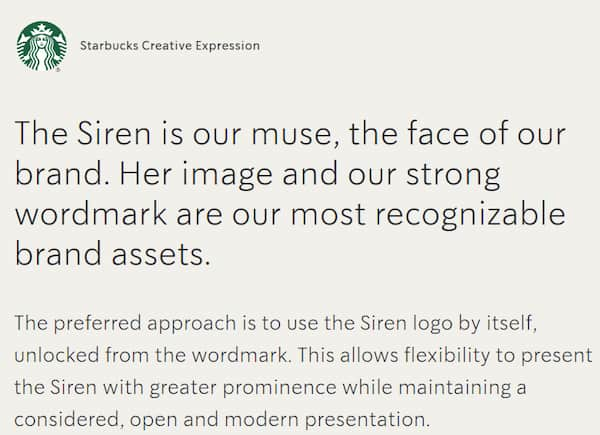
- Overall Layout: This is one of the most fun, approachable, and professional brand style guides on the market. Every section is interactive and beautifully animated, which — in addition to clearly communicating brand style guidelines — proves that Starbucks cares about customer experience.
“You can't help but notice how much attention they have paid to each branding detail. In my opinion, their style guide is one of the best in the industry. It is simple, clear, and detailed enough to convey the brand image. Starbucks has put a lot of effort into creating this guide. Its structure and the way it tells the story are outstanding. The guide is built so intuitively that even a child with no previous web experience will find its way around and will have fun while doing it,” says Biliur.
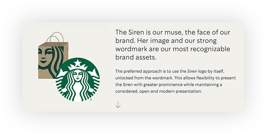
- Logo Guidelines: The Starbucks logo is globally recognizable. It is graphic and high contrast, which is consistent with the rest of its branding. “The logo is an anchor, yet even without it, you can easily recognize the brand. The company knows well who it is and does a great job communicating the brand image,” says Biliur.
- Typography Guidelines: The typography section of the Starbucks brand style guide is incredibly interactive, with animated words and a try-it-yourself box for all three of its fonts. The guidelines acknowledge that in the past, the Starbucks brand used a lot of hand lettering, but explains that it is trying to move away from that aesthetic. Giving users a chance to try their new fonts is a fun way to get people to engage with and familiarize themselves with the new branding.

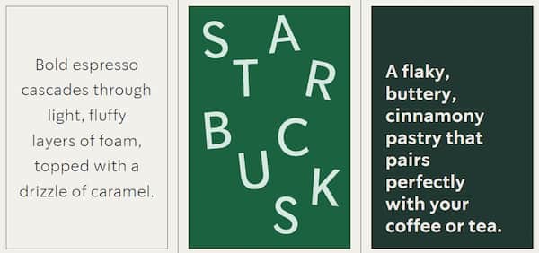
- Photographic Guidelines: Starbucks is clear in its photographic guidelines about the types of images to use for product and editorial purposes. It even includes a section on glassware to use in photographs and how photographers should style whipped cream.
As successful as this guide is, Starbucks could make some elements more effective. “The obvious improvements would be to include greater color detail and the logo dos and don’ts. “I’m sure there is an expanded Starbucks Style Guide that simply is not available to the public,” warns Biliur. Below, we’ve analyzed some areas that could be improved:

- Color Guidelines: While the color guidelines are well designed, using large blocks of each color to subtly communicate appropriate color ratios, Starbucks notably does not identify colors by Pantone or code, which can make it difficult to reproduce them accurately.
- Mission and Vision Statement: Starbucks does not include a mission and vision statement but instead speaks at length about how its voice has changed in recent years. The playful nature of the guide gives the reader a sense of the Starbucks brand personality, but a mission statement would make the style guidebook more impactful by explaining the reasons behind changes to marketing and brand personality.
“When creating a food and beverage style guide, the most important factors are to remember who your customers are, what your product is, and what makes it special. There are hundreds of coffee shops or restaurants to choose from. Focus on the things that make you you,” suggests Biliur.
“When branding is done well,” he continues, “it creates personal and even emotional ties with the customers, which definitely can set you aside from your competitors. You can accomplish these things through choosing the right visuals, like using the right colors, shapes, and typography, and through how you communicate your content strategy or which channels you use. Psychology plays a crucial role in the food and beverage industry. Therefore, it is vital to pay attention to the meaning of shapes and colors and choose the right tone and wording.”
Example Brand Guidelines for Tech
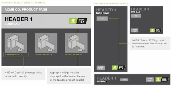
NVIDIA, a graphics processing unit manufacturer, is an example of a company that successfully uses a utilitarian brand style guide. It contains detailed usage information for its logo and includes instructions for combining its logo with that of retailers. NVIDIA is not as public-facing as other brands on this list, so its guide places less emphasis on user experience and may seem less friendly. It is, however, clear and thorough in its descriptions of how and how not to use its assets.
Below are some of the most successful components of the NVIDIA brand guidelines:
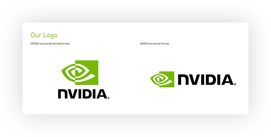
- Logo Guidelines: This guidebook includes detailed spacing and sizing instructions and an extensive list of in-depth use cases. In addition, it provides examples of retired logos and inappropriate uses of the current logo, leaving nothing ambiguous or unclear. “The major strength of this guide is the fact they covered the logo usage very thoroughly,” comments Eberle.
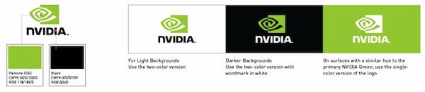
- Color Guidelines:__ The NVIDIA brand guidelines include codes for its colors and specifies three ways to use them. “This feels sufficient for a brand book that is not being marketed to the public,” says Biliur.

- Typography and Language Guidelines: NVIDIA does not name or showcase any fonts but provides detailed instructions for spacing and capitalization for its products. The tone of the guide itself is professional and direct, which also helps communicate the brand’s personality.
While the NVIDIA brand guidelines are thorough and appropriately concise, they lack key information that could strengthen the guide:

- Company Description: While NVIDIA does not include a mission and vision statement, it does include a company description that is written in highly technical, possibly inaccessible language. Graphics processing is a highly specialized field, but its statement might make the brand sound elite or arrogant. The inclusion of a mission and vision statement, or even a brand pyramid, would go a long way to help NVIDIA feel more accessible.
- Photographic Guidelines: NVIDIA provides no photographic guidelines and includes no images in its guide beyond their company logo and product marketing examples. This lack of images makes this guide feel starker and less friendly than some of the other example guidebooks, and it leaves designers uncertain about how to incorporate images into marketing materials.
- Overall Layout: Part of what makes the NVIDIA guide feel so stark and inaccessible is its overall structure. The guide is longer than it needs to be and fails to present information in an intuitive, helpful way.
“Overall, the visual structure of this guide is pretty poor,” says Eberle. “Even scanning this document proves to be difficult as my eye doesn't know where to look on every page. It's basically two pages of information spread across thirty pages. Very little thought went into the usability of this document. There are too many font sizes being used, which reduces clarity, and the images of websites look more like industrial drawings. The whole thing could be reduced to one page, a table with logo usage and a list of legal footnotes, without losing any necessary information.”
To avoid pitfalls like these when creating your own brand guidelines, check out these free brand style guide templates.
“The biggest miss for many technology brands is personality,” warns Eberle. “When creating a technology guide like this, I'd aim to make it more human, more user-friendly, and less like a printer test sheet.”
Example Brand Guidelines for Travel
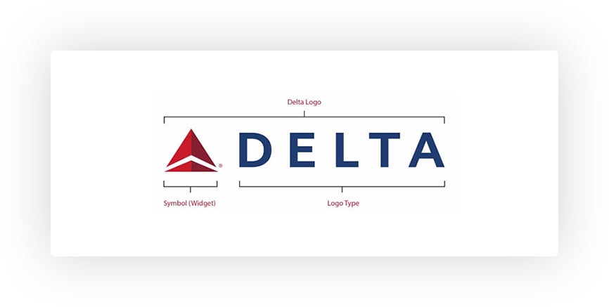
Delta, one of the largest airlines in the United States, has successfully created a professional but personable style guide. A transportation company needs to present a trustworthy image, which Delta accomplishes by keeping its brand style clean, simple, and easy to understand. The guidelines present information in a logical manner, without flashy design or excessive use of imagery. It is thorough without being overstated and covers all the basics of fonts, logos, colors, and trademarks.
“Delta’s focus on the brand integrity through the logo, trademarking, and registration marks is a strength of this guide. As Delta has a variety of trademarked terms, it is useful to include how to use that information here,” says Desmarais.
Below are some of the most successful elements of the Delta brand manual:
- Logo Guidelines: Delta’s logo guidelines are clear and thorough. Within the guide, Delta details acceptable sizes, color variations, dos and don’ts, and spacing. After reading this guide, designers will have all of the information they need for the proper use of the Delta logo.
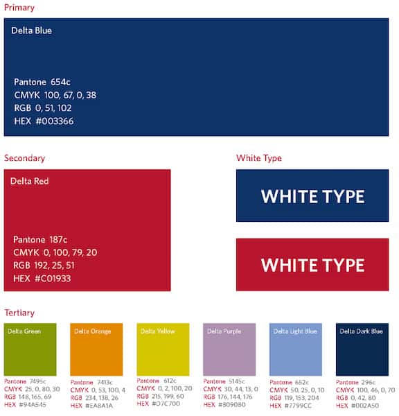
- Color Guidelines: Delta is clear about acceptable use of colors in its marketing materials, providing multiple methods for identifying them and suggesting their ratio of use with their arrangement on the page. In addition, Delta includes detailed instructions on when to use a full-color logo and when to invert it to white.
While this guide succeeds in being clear, thorough, and user-friendly, this guide could be more effective in some areas:
- Photographic Guidelines: Delta does not include clear photographic guidelines and only offers photographic examples of what not to do. By failing to do so, the guide might leave designers in the dark about the types of photos that will best represent the Delta brand.
- Typography and Language Guidelines: Delta does not specify fonts or the best tone of voice to use when representing its brand. Instead, the company merely suggests the tone with the language of the guide itself, which is neutral and professional. Identifying the intended tone for the reader would give designers and marketing professionals a clearer sense of how to represent the brand.
- Overall Layout: Unlike most other guides, the Delta brand guide is not organized into pages, which makes it less easily navigable and user-friendly. “The actual layout of this style guide is hard to read. The brief use of three columns, then back to one, is confusing and hard to parse. There are a variety of notes, which are not intuitive. If there is important information to convey, it should be in the body of the text, not as a final note on a page, or it risks being missed altogether,” warns Desmarais.
- Mission and Vision Statement: Delta does not provide a clear mission statement, though the company indicates in the introduction that it is “committed to making flying better.” Delta’s guide would feel more human and accessible if it included a statement about the vision of the brand.
“When designing travel brand guidelines, the design team must make sure that anywhere you travel, that brand is identifiable, or it risks irrelevance. Delta's guide accommodates for various kinds of print and digital presentations, which increases its recognition. Travel style guides must also think about how different fonts look with accents or unique language characters, which will help with appealing to international markets,” Desmarais suggests.
Example Brand Guidelines for Entertainment
Hulu, one of the most popular media streaming services in the United States, provides a stylish and thorough brand manual that emphasizes the basics, including logo use, colors, and fonts. In addition, the guide provides clear instructions for the writing style and tone of voice that best represent the brand.
Below are some of the elements of the the Hulu guide that make it so successful:
- Overall Layout: From a user experience perspective, the Hulu brand guide is exemplary. The imagery is eye-catching and easy to read, and clear, intuitive navigation buttons help streamline the browsing process.
“The guide is short but clear. There isn't a bunch of jargon or info-dumping onto the reader. The seamless section scroll is also a big draw,” notes Desmarais.
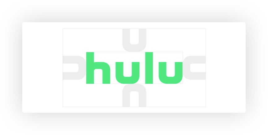
- Logo Guidelines: The logo guidelines in this manual are clear and exhaustive without bogging the reader down in details. Hulu provides useful information about how and how not to use its logo and present it in marketing materials in a concise and readable section.
“Hulu places the design assets front and center, with any potentially downloadable content right where the user can access it,” says Desmarais.
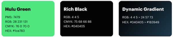
- Color Guidelines: Hulu’s color guidelines are simple and informative. Included in the guide are names of and identifying codes for its colors and instructions for printing its signature shade of “Hulu Green.”
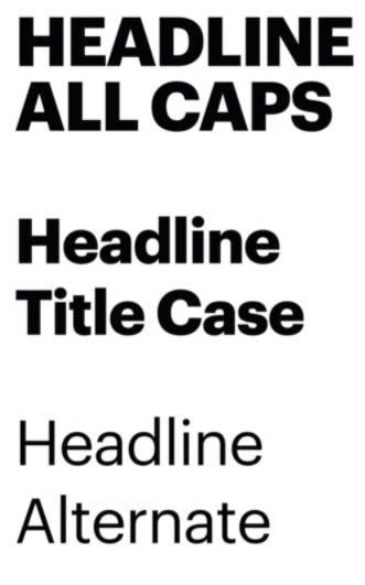
- Typography Guidelines: Information about correct typography usage in Hulu branding materials, including which fonts should be used in which cases, is clear and easily accessible in the Hulu brand guidelines. Also available are convenient download links to purchase the correct font.
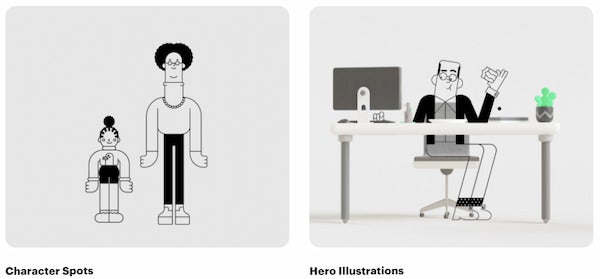
- Photographic Guidelines:__ Instead of photography, Hulu uses illustrations in its branding materials. The Hulu brand guideline provides detailed instructions, including the basic shapes of characters and how they should be arranged, and helpful examples of brand-appropriate illustrations.
Although the Hulu brand guidelines are exceptional in many ways, below are a couple missing or less effective elements that could be addressed to make this guide more effective:
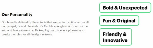
- Mission and Vision Statement: Hulu does not include a mission and vision statement and instead focuses on the voice and personality of its brand. Hulu could create a more cohesive image of its brand by giving the reader insight into why it “break[s] the rules for all the right reasons.”

- Attention to Detail: Hulu’s guide, including this “download print guidelines” button, includes a couple of typos (example: see misspelled“guidlines” above), showing a need for better attention to detail.
“Overall, this is a very strong and accessible guide,” says Desmarais. “When creating an entertainment style guide, the guide should convey the importance of consistency and focus on ease of use. With entertainment guides, the designers should be thinking about the kind of entertainment — are these colors and fonts going to be read primarily on a large screen or on a phone or in print? Another key aspect should be accessibility for both the designer and the user. Hulu uses simple icons and large, thick fonts to make navigating through the platform clear and legible.”
Example Brand Guidelines for Public Services
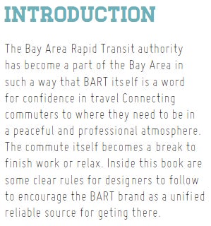
Bay Area Rapid Transit Bay Area Rapid Transit (BART), Northern California’s commuter rail system, uses a brand guide that is both professional and playful. Its branding information is thorough, including basic information as well as additional details about its logo design process, app assets, and stationery. By including a train motif across the top of its pages, the guidelines remain cohesive and fun. “I think BART's style guide is great. It is extremely detailed and pretty easy to follow. It draws a clear picture of the brand without being overly complicated,” says Biliur.
Below are some of the most effective components of the BART style guide:
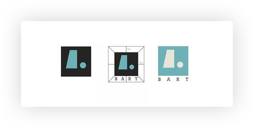
- Logo Guidelines: The BART logo guidelines are clear and comprehensive, including information about colors, spacing, and size. Additionally, they outline the design process behind the logo, which gives a sense of their vision as a brand. To provide as much guidance to designers as possible, the BART brand book also includes examples of inappropriate logo use.
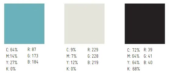
- Color Guidelines: The BART color guidelines are simple but effective. Instead of providing color names, they identify brand colors by CMYK and RGB makeup, which ensures that designers can accurately replicate these shades when creating marketing materials. BART also includes a clear and concise explanation of the psychology behind its choice of colors and provides a sampling of secondary colors to use as contrast.
- Typography Guidelines: BART identifies four different fonts for use in its branding and provides examples of letters and numbers for all of them. BART also separates its use cases into print and web and includes color requirements for each. By doing so, it gives designers plenty of options and information when designing marketing materials.
“I love how the guide also covers the brand's communication through letters, brochures, or other print mediums, along with the app and web designs,” says Biliur.
- Overall Layout: In addition to the playful train motif, the guideline progresses logically from topic to topic and covers each thoroughly without being repetitive or redundant.
“It explains the design choices of the brand. This brand style guide does the job of delivering a brand image exceptionally well,” says Biliur.
Even the most exceptional style guides have some room for improvement. Below are some elements that could be added or improved to create an even more successful brand guideline:

- Photographic Guidelines: BART’s photographic guidelines focus on what not to do and give the designer a reference for what photos would be appropriate. While it is important to know what to avoid, BART could strengthen the guide by providing insight into what a good photo for its brand looks like.
- Mission and Vision Statement: BART does not include a mission and vision statement but instead focuses on the feeling customers should have when engaging with their marketing materials and the tone, which should be “brief but welcoming.” While this information helps to establish a brand personality, BART could strengthen this impression and create a more cohesive brand image by providing a deliberate statement about its mission and vision.
- Attention to Detail: The BART guide book contains numerous typos, which detract from its professional look and feel.
“It is hard to judge a style guide that is done so well,” says Biliur. “From my point of view, there is not much room for improvement unless the company decides to go for rebranding. The only thing I could think of would be that this style guide has been created to be used by professionals only. It could be a bit complex for a person without a design background. However, BART is a transit authority, and its design guide probably wasn't really meant to be used by anyone but professionals.”
He continues, “When I think about creating a style guide for public services, I want to emphasize again that it is crucial to know the guide’s final user, which would be government authorities or design professionals. The guide should deliver its message directly. It has to be concise and clear. There is not room for much fun. It has to speak in a professional language, and each design choice has to be based on the end user’s experience with the service.”
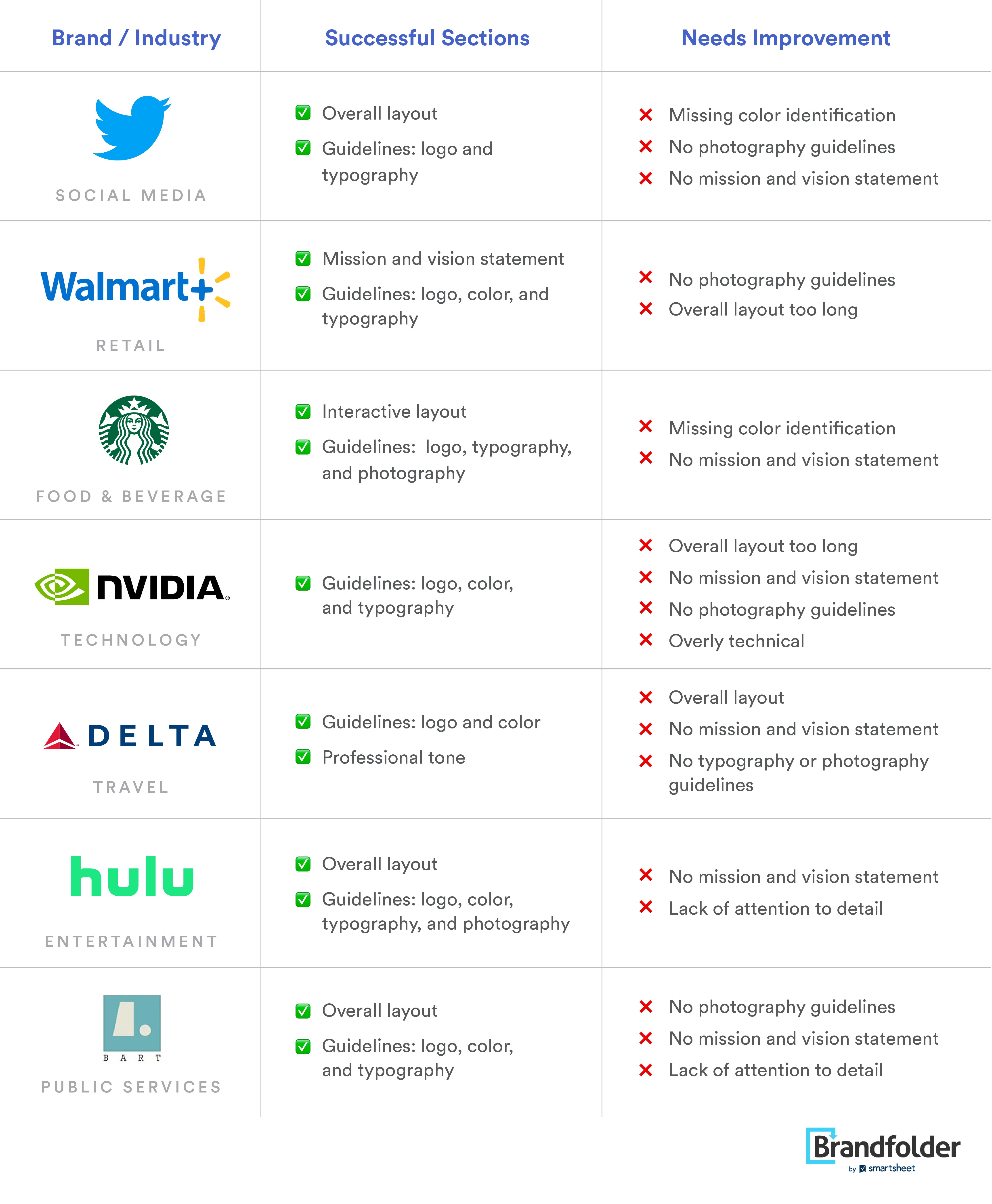
Comparison of Good and Bad Design Elements from Brand Style Guides
After collecting the analyses of our experts, we’ve put together a table that briefly outlines the successes and areas for improvement for each of the example brand style guides above. Use these examples as you create your own brand book, noting both successful elements and pitfalls to avoid.
If you're looking to learn even more about brand guidelines, check out our post: Brand Style Guide: Why You Need It And How To Get Started
Ready to get started? Learn more about Brandguide today.