
Get branding tips and expert advice delivered straight to your inbox.
5 Marketing Assets You Can Enhance with Data Visualization
From the increasing number of blog posts being published every week to the host of videos and podcasts being released, all the statistics point to one trend: there is a deluge of brand content today.
As marketers, we can agree that the pressure to create attention-grabbing and engaging content is real.
One way to set your content apart and make it more valuable to your audiences is to use data visualization.
A study revealed that consumers are likely to believe that a product is more effective when they see a graph or formula, even if it gives them no new information.
Charts, graphs, infographics, and other types of data visualizations are effective because they not only capture attention but also offer value and add credibility when done right. It’s just how some peoples’ brains work.
According to Venngage’s data storytelling benchmark report, 84% of marketers create data visualizations on a regular basis. But, the question remains, are they getting the most out of what they’re creating?
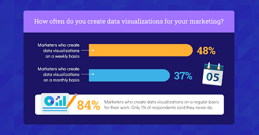 Image Source: Venngage
Let’s take a look at some of the marketing assets you can improve with data visualizations.
1.) Social Media Posts
It’s well-established that social media is a visual medium. Posts with enticing visuals perform a lot better than text-heavy ones.
However, your visual strategy for social media marketing shouldn’t just be restricted to photos and stock imagery. It’s important to continually think of interesting ways to present information and delight your audience.
Enter: data visualization.
Creating original data visualizations for social media is an effective way to communicate data while increasing reach, engaging your community, attracting shares, and ultimately contributing toward a consistent brand experience.
You can use a chart maker to create easy-to-understand charts and graphs that help you tell a story with data. While creating visualizations for social media, it’s important to keep the visual focused on a single statistic or piece of information to avoid overwhelming the readers.
Here’s an example of a social media post by Shopify. They created clear data visualizations to demonstrate how successful independent businesses were during the Black Friday and Cyber Monday weekend.
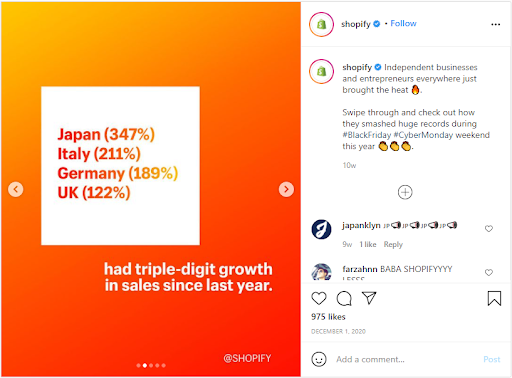 Image Source
2.) Blog Posts
Writing blog posts is more than just sharing your opinion. If you want your blog content to serve its purpose, you need to make it persuasive — and data can help you create a persuasive narrative.
These are a few different ways you can quickly create more research-based blog posts:
- Conduct original research through surveys
- Cite existing research studies and facts
- Look into internal data sources such as Google Analytics, website behavior, sales data, etc.
- Interview relevant, authoritative sources for your blog post
Once you acquire the data, the key lies in presenting it in a visually-appealing and easy-to-digest maner.
Here are a few data visualization ideas for your blog posts:
- Summarize key points using infographics
- Use charts to represent data points
- Create diagrams to map out processes and connect ideas
- Use maps to represent geographic information
Take a look at this blog post by Orbit Media. The blog post reveals blogging statistics that the team put together after surveying 1,000+ bloggers about their content creation process.
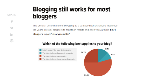 Image Source
3.) Videos
From driving traffic and engaging viewers to attracting leads and increasing conversions — video has proven to be an effective content marketing tool.
Now, imagine being able to combine the power of data and video to drive your marketing goals.
Using data visualizations in videos is a great way to bring boring or difficult to understand data to life and communicate information clearly while keeping viewers engaged.
Start with putting together a narrative and creating a storyboard to organize the flow of the video. You can then create animated charts, graphs, and infographics that will complement and strengthen the story.
Another way to approach this is to repurpose infographics into videos. You can break down the infographic into smaller segments and create short video clips that keep viewers hooked.
Here’s a video the World Economic Forum created to announce the Davos Agenda 2021. They’ve included a mix of animated charts and icons to create a powerful video that grips you from the start.
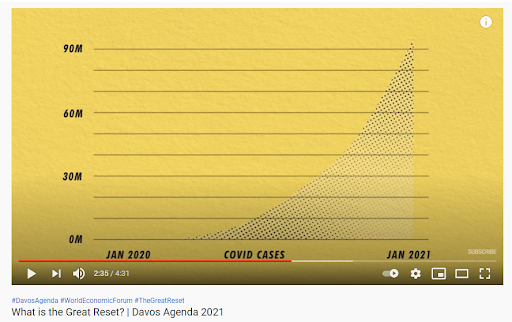 Image source
4.) Presentations
Creating data visualizations isn’t something that’s reserved for customer communication. The same tactic can also be applied while communicating with your internal audience such as the executive team, management, agency clients, or other team members.
In fact, 40% of marketers create data visualizations for presentations, second to social media.
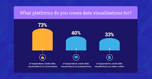 Image Source: Venngage
You can create impactful presentation slides that, even using minimal text, coupled with data visualizations help you reinforce the message.
Make sure you don’t try to cram too much data on one slide because that will end up confusing your audience. Dedicate each slide to a single objective to give your audience the space to digest the information and derive meaningful insights.
Here are examples of some presentation slides you can create with data visualizations.
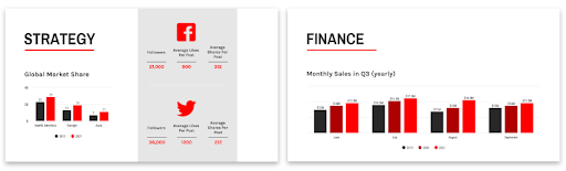 Image Source: Venngage
5.) Email Newsletters
When it comes to visuals in email newsletters, it’s often overlooked the thought of adding infographics or other types of data visualizations to enhance its design and create visual engagement.
Considering the number of emails people receive in a day, including data visualizations to inform your subscribers and get your point across quickly is a refreshing way to capture their attention and offer takeaway value from your newsletter.
Here are some types of information you can communicate with data visualizations and boost your email marketing efforts:
- Company milestones
- Usage statistics
- Year-end summaries
- Product comparisons
- Research data
Take a look at this email newsletter by Truebill. It uses a chart to present the user’s monthly usage and manages to instantly generate interest.
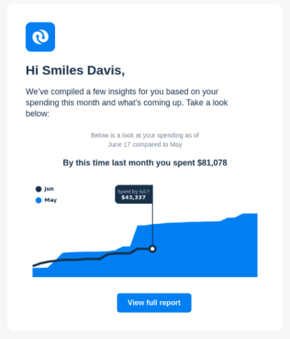 Image Source
The Takeaway
Including data visualizations in your marketing assets is making use of the best of both worlds — you tell a story in an easy-to-understand manner and reinforce your message with the credibility that comes with data.
The key lies in extracting value from the data, weaving a compelling story around it, and choosing the right visualization that best communicates the message.
So, the next time you create content, think of how you can enhance the asset with the help of powerful data visualizations. Chances are, it's easier than you think.
About the author: Simki Dutta is a content marketer at Venngage, a free infographic maker and design platform. She writes about all things marketing and communications. Find her on Twitter and LinkedIn.