How to create an international brand
How to create an international brand
- How Uber rebranded to support international expansion
- How to build an international brand
- Create a "glocal" brand strategy
- Key takeaways for building an international brand
When Dara Khosrowshahi opened the door to Uber's San Francisco headquarters on the final day of August 2017, the pressure in the company's corporate office sucked the door closed behind him. 2017 had been a trying year for Uber, with scandal after scandal and the departure of their founder and CEO, Travis Kalanick.
The brand's image had been tarnished — perhaps irreparably so — but that did nothing to alleviate the lofty expectations of the company's investors who had already poured $24.2 billion into the company. Media outlets spoke of a potential IPO for the company on the horizon in 2019. Then there was Lyft, the thorn in Uber's side, with the pink logo and the happy-go-lucky drivers that just seemed to be doing everything right.
Khosrowshahi felt the weight of those expectations fully for the first time that morning — he needed to take one of the fastest growing technology start-ups of all time and make sure that its growth trajectory didn't miss a beat. And with 90% of the earth's population expected to live in developing countries by 2030, he knew he'd need to accelerate international expansion in search of the growth he'd just signed up to deliver.
How Uber rebranded to support international expansion
Uber had already rebranded — just a year before, in 2016. The effort had been deemed a colossal flop, and aside from the negative associations the new brand had taken on amid the turbulence of the subsequent 12 months, Khosrowshahi and his team knew that the brand they were inheriting would not support the international expansion the company now required. So for the second time in two years, a complete rebrand commenced.
Khosrowshahi turned to his Executive Director of Brand, Peter Markatos, to lead the charge in early 2018. Markatos began by assembling a cross-functional team comprising Uber's own brand team, agency Wolff Olins, and typeface designer Jeremy Mickel. The task in front of them was ambitious.
"This rebrand represents Uber's transition from a San Francisco start-up to a global company," said Markatos. "As we expand our reach into our other markets and modalities, it's super important that it's very clear that when you're getting into an Uber car or on an Uber scooter, you know that is an Uber product. This has implications when it comes to safety, when it comes to accessibility, so we took this very seriously."
The team's goal was clear: "We want Uber to be known as a global platform for mobility," Markatos said. Here's how the Uber brand team delivered.
Start by listening
Markatos's group began the rebrand effort by listening, gathering feedback from Uber users and drivers around the globe. After more than 1,000 hours of "listening to what the brand needs globally," they identified a set of key findings that informed their next steps.
- Uber's existing brand strengths were brand recognition and the association with the color black.
- Movement meant opportunity in the eyes of the of the consumer — as did Uber's product. Markatos and his team embraced this finding, as it gave the brand nearly endless ways to express the brand through movement.
- Consumers didn't associate the brand's existing symbol — the letter U on a black background — with the company. In fact, they found that many Uber drivers were actually turning around the decal in their card, revealing the other side that showed the entire company name. "It doesn't make sense to build more equity into something that people don't understand," Markatos said.
This final finding was of particular interest to Markatos and his brand team. Logos containing a full brand name are most often seen in early stage companies looking to build brand awareness for the first time. Uber already had strong brand recognition, so reverting to a logo that leveraged the full brand name would be abnormal, but there was no denying what they'd seen when observing drivers out in the field.
Many of the brands that he admired had developed instant recognition of logos without any word mark whatsoever — the Nike swoosh and Apple's signature apple with a bite taken out of it came to mind. But there was some precedent for global companies with short names, like eBay and Google, using their full name in their logo.
Uber followed suit.

Key elements of the new Uber brand
Logo
Uber's new logo moves the brand beyond the previously used symbol, this time taking full advantage of the company's name recognition.

"It may not be as cool, not by any means," says Armin Vit, co-founder of UnderConsideration, "But more importantly, it's easy to identify."
Typeface
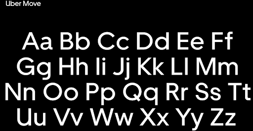
Uber's new typeface — dubbed "Uber Move" — was designed for the company by Jeremy Mickel. Mickel drew inspiration from other typefaces associated with transportation, including Johnston (used in the London Underground) and Highway Gothic (used on American road signs). The typeface is available in every alphabet that's used in a city where Uber is available.
Designer Massimo Vignelli, famous for his work overhauling the typeface used in the New York City subway system, approved of the straightforward typeface Mickel designed.
"I don't think that type should be expressive at all," Vignelli said. "I can write the word 'dog' with any typeface and it doesn't have to look like a dog. But there are people that [think that] when they write 'dog' it should bark.”

Iconography
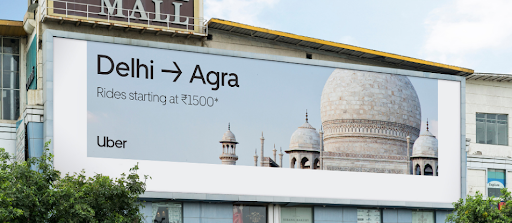
Uber's new iconography also draws inspiration from the global transportation world. The arrow is a key part of their iconography and is internationally recognizable shorthand for connecting destinations.
Voice and tone
Molly Watson wrote the brand's new voice and tone guidelines, built around the following guiding principles:
- Audience first communication
- Straightforward and easy to understand
- Recognizability through consistency
An emphasis on straightforward, functional design runs through all aspects of Uber's new brand.
Results of Uber's rebrand
After the disastrous results of the company's 2016 rebrand, Khosrowshahi and Markatos couldn't afford another misstep, and the emphasis they put on "listening to what the brand needs" appears to have paid off. While few would call the new brand daring, it's firmly rooted in design function over form — a key tenet of the brand's ability to communicate across cultures.
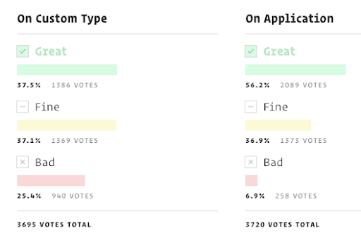
"It was a smart play that repaints the company as more accessible, and readies the company for its inevitable IPO," says Mark Wilson in Fast Company. Results of an UnderConsideration poll also show favorable opinion of the new brand.

"This new logo marks the apex of the extreme simplification trend in logos that we've been seeing in the past year or two and manages to take it to the farthest end of that spectrum," says Armin Vit. "You might disagree with me: but it's actually perfect."
How to build an international brand
While Uber is still actively unveiling their new brand, the process that Markatos and his team employed is worthy of imitation. As the economy becomes more global, brand managers must make sure that their brands can communicate across cultures and avoid unintentionally insulting anyone in the process.
"Culture is created and preserved mainly by communication. For decades, communication had circulated mostly within the borders of countries, helping to build strong national cultures," writes Holt, Quelch, and Taylor in their article "How Global Brands Compete," published in Harvard Business Review. "Toward the end of the twentieth century, much of popular culture became global. As nations integrated into the world economy, cross-border tourism and labor mobility rose; TV channels, movies, and music became universally available to consumers; and, more recently, Internet growth has exploded. Those factors force people to see themselves in relation to other cultures as well as their own."
Today brand managers must take a deliberate approach to making sure their brands translate well across cultures. This process begins with listening.
Host listening sessions to help you understand the nuances of each market
The 1,000+ hours that Markatos's team spent "listening to what the brand needs" is a process now commonly referred to as user experience research. Long before that term became commonplace, Massimo Vignelli took a similar approach to redesigning the signage for the New York City subway system.
In the middle of 1966, when Vignelli landed the project that would change his life, the subway system was over 60 years old and in a state of disarray — there wasn't any cohesive visual hierarchy to the subway map or signage. But before Vignelli began bringing order to the system, he spent the first few years of the project underground watching passengers get on and off of trains and navigate their way through the stations. His designs needed to serve these passengers, so he studied their habits. Where did they go? Where did their eyes look for information as they moved through the stations?
"The problem wasn't about making a great looking visual system and gridded map for the design community — it was about effectively helping people navigate a complicated infrastructure by giving them the right amount of information when they needed it," says Alexander Tochilovsky, Design Curator at the Herb Lubalin Study Center of Design and Typography.
As with Uber's rebrand, design function was of greater importance than design form — and a functional design could not have been delivered without carefully observing users' needs.
How to host listening sessions to understand your users' needs
Clearly identify your goals or objectives.
Brand managers seeking international expansion must first clearly identify the goals of their rebranding efforts. How can a rebrand help solve the problems that your brand's customers are experiencing globally? Start by clearly defining what "success" looks like for your customers in each new market.
Get out of the building
Neither Markatos nor Vignelli delivered their successful rebrands sitting in their offices or a boardroom. Start by getting out of the office and observing how customers experience your brand "in the wild." Ideally, immerse yourself in each international market to see how your brand is experienced (or will be experienced) there. If you don't have this opportunity, hire local help — boots on the ground who can conduct this research for you.
Perhaps no brand has experienced this challenge as significantly as Airbnb. When the company launched, CMO Jonathan Mildenhall was tasked with convincing people around the globe that staying in a stranger's house wasn't awkward or dangerous. Mildenhall recognized early on that some elements of his brand were global — everybody wanted clean sheets — but beyond that, localization would be a key to his success.
Under his guidance, Airbnb built a dedicated localization department responsible for making the site accessible around the globe and for local storytelling, which was essential for developing trust and a sense of community between hosts and travelers. The move proved effective, as Airbnb now operates in more than 190 countries and 34,000 cities — more than double that of Uber.
IKEA is another brand that's reaped the benefits of carefully observing their customers' lifestyles and use of their products across cultures. While their furniture style remains decidedly Swedish, the company regularly conducts interviews via home visits, so that they can make furniture that relates directly to how it will be used. The room setups in IKEA stores are also adapted for each market. While the sets may contain the same furniture, stores in Japan, for example, have floors covered with tatami mats — a mainstay of the Japanese household.
Research existing competitors in each market.
Brand managers should also research any existing competitors — and their customers' experiences of those brands — before moving into a new market. This can provide valuable insight into how your brand is differentiated in the market; after all, your points of differentiation in your home market may not be the same as those in international markets. If you're unable to find competitors in new markets, carefully consider why — there could be regulations harmful to your brand that you're unaware of.
Compile your findings and connect the dots.
After witnessing your target customers and the problems they face in each international market, think about how your rebrand can help solve their problems. This will define the objectives and goals that your rebrand should seek to address.
With a solid understanding of how your rebrand can serve your target customer, you're now ready to begin creating your "glocal" brand strategy.
Create a "glocal" brand strategy
The most successful leaders in creating global brands — from Markatos at Uber to Mildenhall at Airbnb — recognize that while their brand needs consistent messaging and positioning, it has to be combined with an understanding of local culture and tastes. Holt, Quelch, and Taylor refer to this tactic as "Glocal Strategy" in their article "How Global Brands Compete."
One easy way to create a glocal strategy is to position your product or brand next to cultural icons or celebrities. During the 2018 FIFA World Cup, Coca-Cola's international homepages featured local celebrities and cultural references alongside instantly recognizable and consistent Coca-Cola branding.

Important considerations for your glocalization strategy
- Make sure that your logo is sensitive to local cultural norms
- For example, a logo featuring a woman's face may not be appropriate in many Middle Eastern markets. Branding agencies with experience researching cultural sensitivities can help you avoid such mistakes.
- Airbnb considered this thoroughly when they launched their logo, the "Bélo," designed to be an international symbol for belonging.
- Consider registering country-specific domain names.
Most websites can be easily translated these days, but you should also consider registering country-specific domain names for each of the markets your brand is entering. The United Kingdom's Department for Business, Innovation and Skills found that a monolingual approach to business costs the nation's economy £48 billion a year — 3.5% of its GDP. - Trademark your products to the extent that you can.
Knock-offs are rampant in many parts of the world, and trademark laws vary greatly by country &mdashl it's worth having whatever protections you can as provided by law. Start by registering with the US Patent and Trademark Office: you can apply directly on their website.
The World Intellectual Property Office is a good resource for looking at trademark laws by country. Consider using the Madrid System, which allows you to register trademarks with one application in 119 countries. - Make sure your product names and copy are culturally sensitive across markets.
Don't trust computer translations when naming your products or writing copy for international markets. Instead, hire native speakers that live locally.
For example, Starbucks's Gingerbread Latte didn't sell well in Germany, even though gingerbread is a popular holiday cookie in the country. Sales of the drink increased dramatically when Starbucks began using the German word for gingerbread and rebranded the drink the Lebkuchen Latte. - Clairol failed to do their homework when they launched the Mist Stick, which translated to Manure Stick in Germany.
- Colgate made a similar misstep when they decided to sell a toothpaste in France called Cue — which is also the name of a French pornographic magazine.
- Gerber marketed baby food in Africa with a cute baby on the label. They didn't know that, in Ethiopia, for example, product labels usually have pictures of what's inside since many consumers can't read.
- Coors translated its slogan, "Turn It Loose," into Spanish, where it's a colloquial term for having diarrhea.
- KFC made Chinese consumers a bit apprehensive when "finger licking good" was translated as "eat your fingers off."
- The American Dairy Association replicated its "Got Milk?" campaign in Spanish-speaking countries, where it was translated to "Are You Lactating?"

International branding bloopers
Key takeaways for building an international brand
- Use straightforward visual communication that's easily understood by customers across cultures; design function trumps design form.
- Keep your product's messaging and positioning consistent, but adapt your tactics for the nuances and sensitivities of each international market.
- Brands should seek to become associated with a single, universally accepted idea — like Uber has done with mobility.
- Enlist the help of native speakers living locally or agencies with experience identifying cultural sensitivities to avoid using inappropriate language or iconography.
Further Readings
- How To Build An International Brand (Inc)
- 20 Epic Fails In Global Branding (Inc)
- Building A Global Brand (57 Brand Haikus, Joe Benson)
- How To Build A Global Brand (HBR)
- How Global Brands Compete (HBR)
- Making Your Brand Translate To Overseas Success In Every Language (Virgin)
- How Airbnb Expanded to 190 Countries By Thinking Glocal (Forbes)
- 6 Tips For Registering A Trademark Overseas (Entrepreneur)