Rebranding disasters
Rebranding disasters
- Common reasons rebrands go wrong
- How to avoid a rebranding disaster
- Key takeaways
Share this article:
Rebranding is a long, arduous process that's notoriously difficult to get right — but rebranding a sports team is a particularly tough assignment. Few industries have followers as rabidly passionate as professional sports and few are as steeped in tradition. The challenge, then, becomes honoring the tradition and brand that fans likely grew up with, while still moving the brand forward.
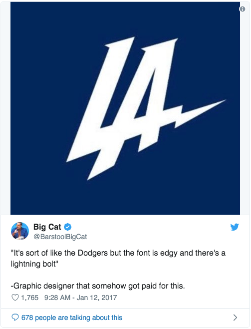
The team tasked with rebranding the Los Angeles Chargers prior to the 2018 NFL season faced even further challenges. The team had never won a Super Bowl and had just been abandoned by voters in their hometown of San Diego, forcing the franchise to relocate to Los Angeles. The move presented an opportunity to rebrand and give the organization a fresh start, but the rebrand only added to the franchise's turmoil.
The team's new logo was immediately ridiculed everywhere from Twitter to ESPN, to the extent that the team claimed it was just a placeholder. "Clearly, we miscalculated how the logo would be received, and we've taken it out of the rotation," said Chargers President of Business Operations A.G. Spanos. The team responded by simply tweaking the new logo's color scheme before scrapping the direction altogether within a week.

What can we learn from the Chargers and other rebranding disasters to help us avoid similarly costly and embarrassing mistakes?
Common reasons rebrands go wrong
There are a plethora of reasons that rebrands go awry. Let's review a few of the most common so that we can avoid these mistakes ourselves.
The rebrand is disingenuous
Perhaps the most common reason that a rebrand ends in disaster is that a brand tries to rebrand as something that it simply isn't. Take, for example, British Petroleum (BP), which rebranded to replace a logo that had been with the company for 70 years. The company's new "Helios" logo was meant to symbolize the company's "green" growth strategy: it was designed to look like the sun. While the concept was well-intentioned, it certainly missed the mark — any way you cut it, there's nothing "green" about drilling for oil.
While the new logo created a bit of an uproar, it didn't truly come back to bite BP until 2010, when the company was responsible for the Deepwater Horizon oil spill in the Gulf of Mexico, the largest spill in the history of the petroleum industry. As 4 million gallons of oil polluted the Gulf and killed wildlife, non-profit environmental groups like Greenpeace seized the opportunity to make a mockery of BP's new logo.
The lesson here is simple: don't rebrand in an effort to be something that you're not. Your brand must reflect the company that you are, not the company that you aspire to be.
The rebrand discards brand equity
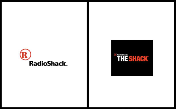
RadioShack was a rare, enduring brand in the electronics retail space, having opened their doors in 1921. But when the company rebranded in 2009, they did so for all the wrong reasons. While sales were admittedly slumping, rebranding as "The Shack" was an effort to be hip — not exactly a compelling reason to rebrand a franchise with 400 locations. The rebrand flushed away years of brand equity that had made RadioShack a household name.
"Why would anyone throw away decades of brand value, which actually shows up on the balance sheet as an intangible asset, just to try to be cool for a few minutes?" asked branding guru Rob Frankel.
Brand equity aside, the rebrand was poorly executed and frankly just didn't make sense. The new brand logo read "RadioShack The Shack," and conjured up images of a shack — most of which don't have electricity, let alone high-end electronics.
The lesson here is whenever you're considering rebranding, stop to think about the value of your existing brand equity — it likely took years to build and can disappear instantly with a name change.
The rebrand tries to serve too many objectives
It's tough going out there for a brand like Pepsi, one that will always be compared to a competitor that has one of the most iconic brands of all time, Coca-Cola. The proverbial chip on Pepsi's shoulder has led the company to rebrand countless times over the years, a choice that's probably hurt the brand more than it has helped.
Any way you cut it, Pepsi's 2008 rebrand was a colossal flop. The new logo was designed to represent a "cheeky smile."
"The white stripe on the new logo varies across Pepsi products, getting wider or thinner depending on product," read an article in Business Insider. "The design team that spearheaded the campaign explains that they're supposed to be 'smiles,' but we don't really see it."
The smile aside, the goals that agency Arnell Group set out with for the rebrand were preposterous, attempting to link the logo to Hindu tradition, the Parthenon, the Mona Lisa, Earth's gravitational field, and radiation from the sun, among a slew of other factors. The "breathtaking design strategy" may very well be the greatest tragedy of a design brief of all time. And then there was the cost of the rebrand: an estimated $1.2 billion.
The lesson here is to focus your rebrand around a single theme that matters to your customers — trying to achieve multiple goals or associations with a single design rarely succeeds.
The rebrand tries to fix what isn't broken
In 2010, clothing retailer Gap rebranded for no apparent reason during the middle of the holiday season. Consumers were confused, and the design community was quick to torch the company's new brand.
Gap responded and essentially poured fuel on the fire by saying that the new brand was just a trial — they were actually planning to crowdsource their new brand by testing a series of new logos and letting consumers choose which they liked best.
While Gap's old logo was solid and classic, like the company's clothes, the new logo was generic and confusing. It used Helvetica, at the time a 71-year-old typeface that failed to provide a unique visual identity for the company — and the same typeface used by one of Gap's primary competitors, American Apparel. The blue square used in the logo was altogether confusing. "The square gradient is unfortunate because it's completely gratuitous, like an asterisk at the end of a word, except there is no footnote," said UnderConsideration Co-founder Armin Vit. "It's just a vapid reminder that the word Gap used to live within a blue square in its previous incarnation."
Amidst the backlash, Gap reverted to their original brand and logo after just six days. The cost of the rebrand? A cool $100 million.
The lesson here is don't try to fix what's not broken; and if you do, use a font other than Helvetica.
How to avoid a rebranding disaster
Now that we've taken a look at several rebranding disasters, the question quickly becomes "How can I avoid a similar fate when rebranding my company?" That process begins with making sure that a rebrand is truly necessary. A rebrand shouldn't be undertaken to increase your company's performance. A rebrand should only be considered if there's something fundamentally wrong with your brand that must be changed in order for you to move forward.
If you do decide that a rebrand is necessary, the scope of the effort can vary greatly. For example, a complete name change is typically a dramatically larger and more involved undertaking than simply tweaking your logo like BP did. Once you decide on the scope of your rebrand, you can test it to gain some degree of confidence in how the new brand will be received.
How to test your new brand
Testing your new brand prior to revealing it to the world is one of the most surefire ways to avoid a rebranding disaster. And considering the costs we've seen associated with rebranding missteps, it's absolutely worth doing. Follow the process below to test your new brand with your internal team, your existing customers, as well as new markets that your brand is looking to enter.
- Your internal team— Before you show your new brand to any outside parties, you should test it to make sure you have buy-in from stakeholders within your organization. Start by creating a document that clearly provides answers to the following questions:
- Why was the rebrand necessary? Everybody must understand the reasons for the rebrand.
- What's meaningful about the new direction? While your new brand doesn't have to (and likely won't) resonate with everybody, your internal team at least needs to understand the new direction.
- What are the goals of the rebrand? Provide clear guidelines to your team, so everyone will know how the success of the rebrand will be assessed and what the project was designed to achieve.
- Your existing customers— After testing your new brand with your internal team, you'll want to make sure that your brand resonates with your existing customers and doesn't alienate them. "A rebrand has to resonate with audiences without losing touch with the current customer base," says Grant Polachek, Director of Marketing at Squadhelp. Use surveys and focus groups — providing a small incentive to customers usually helps with recruitment — to enlist their help in providing feedback and validating your ideas. Avoid asking customers if they simply "like it"; instead, ask them directly if the new brand achieves the objectives that it was designed to address.
- New audiences— Often brands rebrand in an attempt to reach new or larger audiences; if this is the situation you find yourself in, it's absolutely critical that you test the new brand with prospects from the audiences that you are trying to reach. Present new audiences with your rebranding concepts, and ask action-oriented questions like "Which of these products are you most interested in learning more about?"
Testing your rebranding concepts should give you peace of mind and help mitigate the risk of your own rebranding disaster. While that's the case, keep in mind that rebranding disasters rarely kill a company. They may be expensive and wipe away years of brand equity, but companies like BP, Gap, and Pepsi have all survived their branding missteps. And if you do find yourself in the midst of a rebranding disaster, owning up to your mistakes and learning from them is key to minimizing any further damage.
"We've learned a lot in this process," said Marka Hansen, President of Gap Brand North America. "It's clear that we did not go about this in the right way and that we missed the opportunity to engage with the online community. This wasn't the right project at the right time for crowd sourcing.”
Key takeaways
- Rebranding disasters happen for a variety of reasons, but most are a result of the brand acting in its own self-interest rather than the interests of its customer base.
- Your rebrand needs to be reflective of the company that you are, not the aspirational attributes of the company that you'd like to be.
- Name changes can be particularly catastrophic — be careful to avoid throwing away existing brand equity that took years to build.
- Testing new brand concepts with your internal team, customers, and prospects from new markets can help you mitigate the risk of a rebranding disaster.